In the fourth part of this series, learn how the size of web elements are calculated. Then, use CSS to apply general layout and styling to the elements and text on the page.


您需要什么
The downloads include the complete set of Creative Cloud Libraries and project files for this tutorial series. You can continue to build on your starting file in Part 1, or navigate to the relevant folder to use the starting file for each section.
Introduction
Welcome to this fourth part of this tutorial series on building a simple, responsive website in Dreamweaver 2015. The first three parts were devoted to defining a site in Dreamweaver, and then building two pages using a logical HTML structure. Figure 1 shows what the home page looks like if you load index.html into a browser.


The rest of this tutorial series, apart from the final part, is devoted to transforming this ugly duckling into a simple, yet elegant design using CSS and adding images. In this part, you'll learn how to simplify width and height calculations, change the font, and use the CSS Designer to create basic styles.
Create a snippet to simplify width and height calculations
In CSS, every element is treated as a box. In the default CSS box model, an element's width and height normally apply only to the element itself. If you add space (padding) around the element's contents, it's not included in the calculation. Borders are also excluded. As a result, if you declare the width of an element as 250px and its height as 100px, then add 20px of padding on each side, plus a 5px border, the overall width becomes 300px, and the overall height 150px (see Figure 2).


This can make calculations difficult, particularly when you want to mix pixel and percentage dimensions. It's more natural to think of padding and borders as being an intrinsic part of an element's size. To make it easier to control page layout, most professional web designers add two short style rules at the beginning of their style sheet to include padding and borders in the overall width and height of an element. The rules are so useful, you'll save them in Dreamweaver's Snippets panel ready for insertion into styles for other websites.
- With index.html open in the Document window, click responsive.css in the Related Files toolbar (see Figure 3) to open the external style sheet in Split View.


- Click inside the code, and create a blank line on line 2, and type /* Simplify width and height calculations */. In CSS, anything between /* and */ is treated as a comment, so this is just a reminder of what the code does.
- Create a new line, and type html followed by an opening curly brace ({). Style rules consist of a selector followed by property/value pairs between curly braces. The simplest type of selector consists of an HTML tag without the angle brackets. The top-level element of every web page is
<html>, sohtmlis a CSS selector that affects everything in the page.
- Press Enter/Return immediately after the curly brace. Dreamweaver indents the next line, and immediately pops up code hints for CSS properties. Start typing box. As you type, Dreamweaver filters the code hints, searching for matching text in all valid properties even in the middle of the property name (see Figure 4).


- The property you want is
box-sizing. Use your arrow keys or mouse to select it from the code hints, and press Enter/Return. Dreamweaver completes the property name, and follows it with a colon (:). Code hints pop up again. To make the code easier to read, add a space, then selectborder-boxfrom the list, and end the line with a semicolon (;). - On the next line, create the following style rule:
On the next line, type a closing curly brace (}) to end the style rule definition.
*, *:before,
*:after {
    box-sizing: inherit;
}
- Open the Snippets panel (in the Design workspace, it's docked with the Files panel), and select the CSS_Snippets folder (see Figure 5).
This uses what's known as a group selector. It consists of three selectors separated by commas, and applies the same style(s) to all of them. The asterisk (*) on its own is the universal selector, so it applies to every element. The two other selectors use what are known as pseudo-elements.
The meaning of this style rule is rather advanced. At this stage of learning web design, all you need to know is that it does the intended job. The important point is to make sure you type it correctly. Although you can have a space after the colon following the box-sizing property, there must be no space surrounding the colon in *:before and *:after.
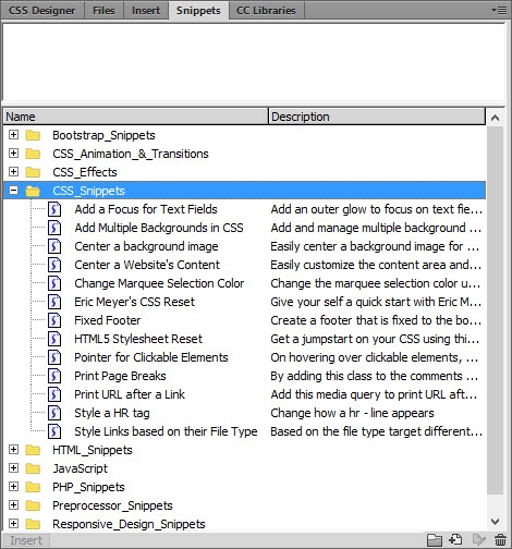

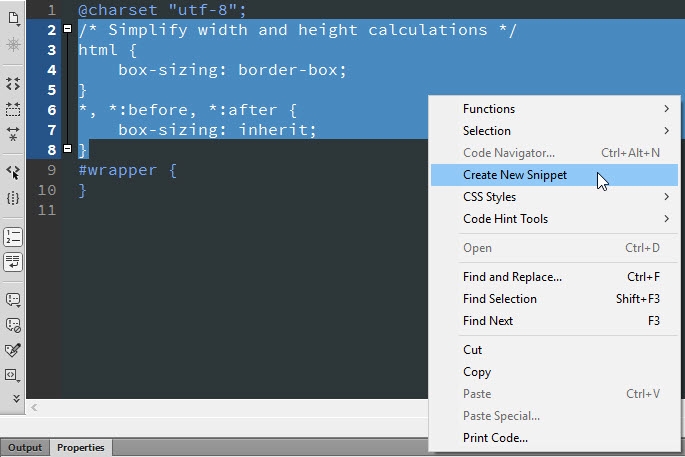
- In Code View, select the comment and two style rules you have just created, right-click, and select Create New Snippet from the context menu (see Figure 6).

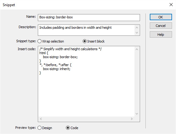
- In the Name field, type Box-sizing: border-box. For Description, enter Includes padding and borders in width and height. For Snippet type, select the Insert block radio button. Leave Preview type at the default Code. The panel should look like Figure 7.
This opens the Snippet dialog box with the selected code already in one of the fields.

- Click OK to save the snippet. Because you selected the CSS_Snippets folder in the Snippets panel, the new snippet is automatically stored in the same folder.
Including this snippet in your style sheet means you can adjust an element's padding and borders without affecting its overall dimensions.
You can synchronize your snippets with the Creative Cloud. Check the online documentation to learn more about using snippets.
Install an Adobe Edge Web Font
By default, browsers display text using Times or Times New Roman, a serif font (serifs are little decorative hooks at the end of strokes). The CSS font-family property allows you to select fonts, but your choice is normally limited by the range of fonts available on the device used to view the site. Using a web font that's downloaded with the page removes that restriction. Dreamweaver has built-in access to many free web fonts hosted by Adobe. First, you need to enable them in Dreamweaver.
- Select Modify > Manage Fonts to open the panel shown in Figure 8.
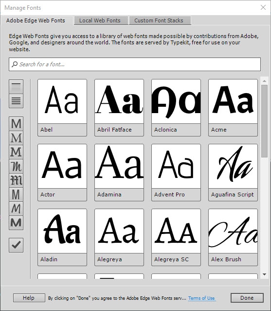

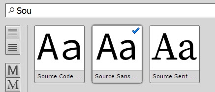
- The font you're looking for is called Source Sans Pro. Start typing the name in the search field, and you'll be presented with three options. Click the middle one, Source Sans Pro. A check mark indicates that the font has been selected (see Figure 9).

- Using an Adobe Edge Web Font is free, but is subject to a license agreement. You can see the Terms of Use by clicking the link at the bottom of the panel.
- If you're happy with the Terms of Use, click Done.
Source Sans Pro is a sans-serif font. In other words, it doesn't have decorative hooks at the end of strokes. You can clearly see the difference between the samples of Source Sans Pro and Source Serif Pro.
Dreamweaver installs Edge Web Fonts in your personal configuration folder, making them available for use in all the sites you create in Dreamweaver.
Use the CSS Designer to add basic styles to the page
You saw earlier how code hints can speed up the creation of style rules in Code View. Dreamweaver also has the CSS Designer, a panel that lets you style your page while watching the changes happen in Live View. In this section, you'll use the CSS Designer to start adding basic styles to responsive.css and seeing how they affect index.html.
- With index.html open in the Document window, click the Live button so that Live View fills the entire window.
- Open the CSS Designer by clicking its tab in the panel group on the right of the screen (it's docked with the Snippets panel that you used in the previous section). The CSS Designer consists of four panes: Sources, @Media, Selectors, and Properties (see Figure 10).
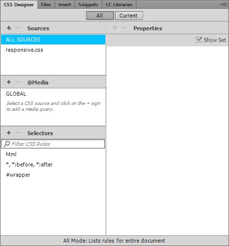

By default, the CSS Designer has a two-column layout with the Properties pane on the right in the Design workspace. If you have a small monitor, you can convert it into a single-column layout by dragging the side of the panel group inwards.
When creating new style rules, you should normally make sure that the All button is selected at the top of the panel.
The role of each pane is as follows:
- Sources: This lists where all the styles in the current page come from. They can be in external style sheets, such as responsive.css, in a block embedded in the page, or dynamically linked.
- @Media: This lists media queries used in the various sources. You'll learn more about this pane in part 7.
- Selectors: This lists all the CSS selectors in the selected source. There’s a search field at the top to help find selectors in a large style sheet.
- Properties: This is where you define the properties and values for a selector. If the Show Set check box is selected, the pane shows only properties that have been set. When the check box is deselected, the pane lists the 50 or so most commonly used properties for layout, text, border, and background.
- Make sure the All button is selected at the top of the CSS Designer.
Select responsive.css in the Sources pane.
You don't need the @Media pane until part 7, so close it by dragging the top edge of the Selectors pane upwards.
The Selectors pane lists the selectors that have already been created. The last one (#wrapper) doesn't yet have any styles. When you create a new selector, Dreamweaver always inserts it at the bottom of the style sheet unless another selector is already highlighted. It's a good idea to keep styles in a logical order, so select*,*:before,*:after, and deselect the Show Set check box at the top-right of the Properties pane.
- Click the plus button at the top-left of the Selectors pane to create a new selector. Dreamweaver suggests a name for the selector based on what's currently selected in Live View. Ignore the suggestion, and type body. Press Enter/Return twice to confirm the change. With the new selector highlighted (see Figure 11), you can now create a style rule that affects everything in the page by setting the values of properties in the Properties pane.
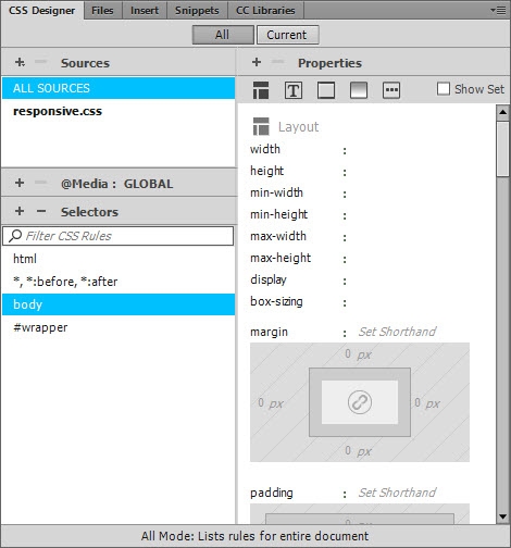

- In the Layout section at the top, there's a visual tool for setting the margin property. Rather than use it on this occasion, just click Set Shorthand to open an editable field, and type 0. Press Enter/Return to confirm the edit.
You should notice the content in Live View move slightly up and to the left as the default 8px margin is removed from the element.
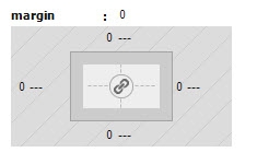
Themarginproperty in the Properties pane is now in bold type, indicating that it has been set. Also the value for each side in the visual tool has been set to 0 (see Figure 12).

- Click the Text
 icon at the top of the Properties pane to jump to the section for text properties. The first property listed,
 color, sets the color of text. All the colors for this project are in the CC Library that you installed in part 1.
- Click the color well for the
colorproperty to open the color picker.
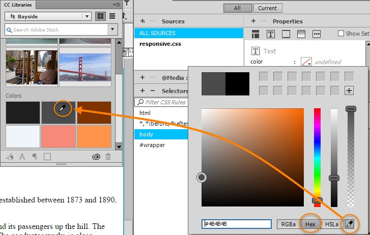
The CC Libraries panel is docked with the CSS Designer, so drag the CC Libraries tab to detach it from the panel group so that it floats over the Document window.
Make sure the Hex button at the bottom-right is selected. This sets the color using hexadecimal notation, which is supported by all browsers.
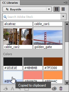
Select the eyedropper tool at the bottom-right of the color picker, and sample the color from the light gray color swatch in the CC Libraries panel (see Figure 13). This sets the color to #4B4B4B, which is easier on the eyes than pure black on white.

- Click to the right of
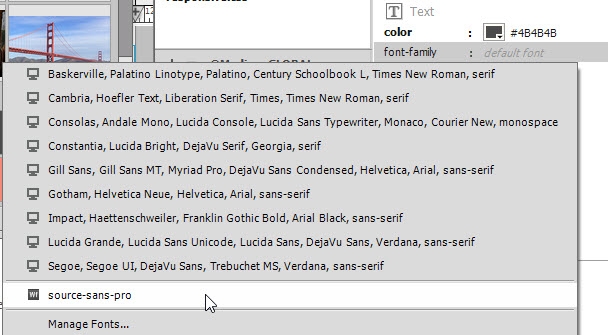
font-familyto open a menu of commonly used font stacks. Select the Adobe Edge Web Font that you installed earlier. It's listed at the bottom assource-sans-pro(see Figure 14).
Click away from the color picker to close it.

- The value for
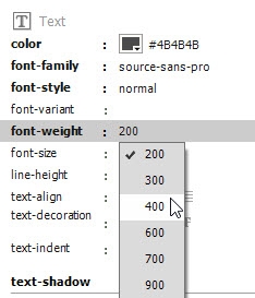
font-style(normal) is OK, but the value offont-weight(200) is the equivalent of extra-light.
Click 200 to open a menu of the font's available weights, and select 400, which is the equivalent of normal (see Figure 15).
Font stacks list commonly available fonts in order of preference. If the first one isn't available on the user's device, the browser tries the second one, and so on until a suitable one is found.
Choosing an Edge Web Font automatically sets the values for the font-style and font-weight properties in addition to font-family. There's also a new file (source-sans-pro:n2,n4:default.js) in the Related Files toolbar, and a read-only source in the Sources pane (sometimes you'll see more than one). The new file and read-only source(s) load the font dynamically from an Adobe server. You can't edit them.

- Click alongside
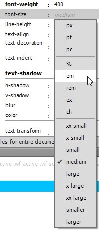
font-sizeto open a menu of units of measurement and keywords that can be applied to fonts, and select em (see Figure 16).
The font-weight property can be set using a number ranging from 100 (light) to 900 (heavy) increasing in steps of 100, or using one of the keywords normal (equivalent to 400), bold (700), bolder, or lighter. Edge Web Fonts always use the numeric values. The available values differ with each font. As Figure 15 shows, source-sans-pro doesn't support 100, 500, or 800.

- Click the Background icon at the top of the Properties pane to skip to the background properties.
- Instead of using the color picker to set the
background-colorproperty, this time just click the pale blue color swatch in the CC Libraries panel (see Figure 17). This copies the color in hexadecimal notation to the clipboard.
Live View will go blank. To quote the reassuring words on the cover of The Hitchhiker’s Guide to the Galaxy: Don’t panic!
When you select a unit of measurement, Dreamweaver sets the value to 0. An em is a proportional measure based on the height of the current font, but setting it to 0 causes the text to disappear.
Simply type 1, and the text will reappear. Setting the value to 1em in the body style rule specifies using the browser default for paragraphs and list items, which is normally 16px.

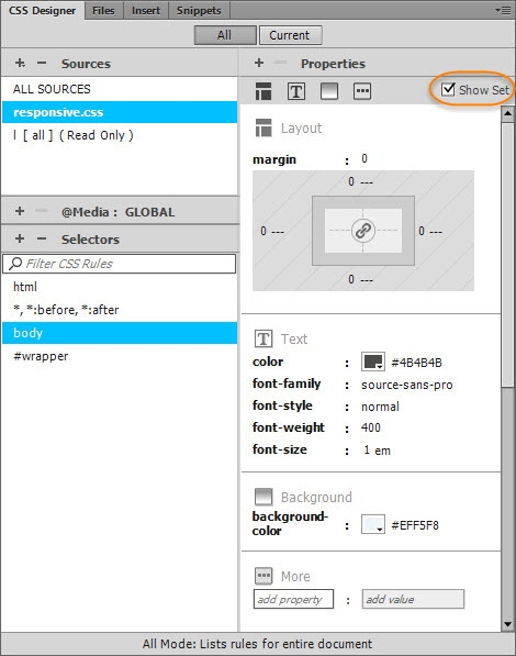
- Select the Show Set check box at the top-right of the Properties pane to see all the CSS properties that have been set on the page body (see Figure 18).
Click to the right of the color well for background-color to open an editable field, paste the value, and press Enter/Return to confirm the change. The page background is now pale blue.

Set properties directly in the CSS Designer
Selecting common properties from the various sections in the CSS Designer is a great way to learn CSS. But let's say you're already familiar with CSS, and just want to get on with setting properties and values. You can do that in the More section at the bottom of the Properties pane. Dreamweaver speeds up the process with the help of code hints. Let's try it. Even if you're a complete beginner, you should be able to follow these instructions:
- Make sure that the All button at the top of the CSS Designer is selected, and that responsive.css is selected in the Sources pane. If necessary, select the Show Set check box at the top-right of the Properties pane.
- In the Selectors pane, select
#wrapper. The hash indicates that it's an ID selector, so it will apply style rules to the with the IDwrapper. If it's not listed, you can create it by clicking the plus button at the top-left of the Selectors pane and typing#wrapperin the editable field.
Because no styles have been set for this selector, the Properties pane displays only More and two editable fields to add a property and value.
- Click inside the
add propertyfield and start typing width. As you do so, code hints display matching properties. When width is highlighted, press Tab or Enter/Return to select it.
- To prevent the wrapper getting too wide on large screens, add another property,
max-width, and set its value to 1000px.
- Center the wrapper by adding the
marginproperty, and setting its value to 0 auto. This is shorthand for no margin on the top and bottom, but an automatic margin on the left and right. As long as the Document window is wider than 1000px (the value ofmax-width), the page content springs to the center of Live View.
- Add the
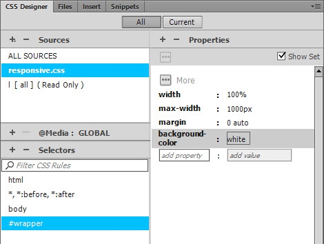
background-colorproperty, and set its value to white. This is a color keyword that's recognized by all browsers. The Properties pane should now list four style definitions for the#wrapperselector (see Figure 19).
The focus moves to the second field. Type 100%, and press Enter/Return. This makes the wrapper fill the full width of the screen.

- Save your work by selecting File > Save All Related Files. Make a habit of doing this regularly while styling a page.
The text content is now centered against a white background. If the Document window is wider than 1000px the pale blue background of the body is visible on either side. There’s also a mysterious gap at the top of the page, and the text is flush with the left side of the wrapper <div>. You'll tackle those issues in part 5. But first, a word about pixel measurements in web pages.
Pixels and high density displays
A pixel is one of the tiny dots that make up a computer display. In the early days of the web, 1px meant the same size as one of those dots. Over the years, technology has improved, and the dots have become smaller and smaller. Fortunately, CSS anticipated this situation. Pixels used as a unit of measurement are not dependent on the size of physical pixels used in a device's screen. As a result, the 1000px set as the maximum width for the wrapper <div> should look roughly the same size on an ancient monitor and the latest high density display.
The site is slowly beginning to look more presentable, but there's still a long way to go. The next stage is to sort out problems with horizontal and vertical space, and to brighten up the page with responsive images.