In the sixth part of this series, learn how to style the menu and links and apply JavaScript to hide and display the menu depending on the screen size.


您需要什么
Note: The sample files include the complete set of Creative Cloud Libraries and project files for this tutorial series. You can continue to build on your starting file in Part 1, or navigate to the relevant folder to use the starting file for each section.
Introduction
Welcome to part 6 of this tutorial series about building a simple, responsive website in Dreamweaver 2015. The single-column version of the design is almost complete. All that remains is styling the links and navigation menu. You’ll also attach a JavaScript file to display and hide the menu on small screens.
Style links with pseudo-classes
By default, links are blue with an underline. When a link has been visited, it turns purple. Although these are well recognized visual signals, they rarely fit in with a modern design. These days, it's common to remove the underline, and to change the way a link looks when you hover over it. To create styles for links in different states, CSS uses pseudo-classes. They're called pseudo-classes because, unlike an ordinary class, you don't add a class attribute to the element. The pseudo-class is applied dynamically by the browser using the styles in your style sheet.
A pseudo-class begins with a colon, and is appended directly to a selector. The pseudo-classes used with links are as follows:
:linkThis styles a link in its unvisited state.:visitedThis styles a link that has been visited.:hoverThis styles any element (not just a link) when the mouse pointer hovers over it. You used this in part 5 to change the look of an image when hovered over.:activeThis styles an element at the moment it’s clicked.:focusThis styles an element that has focus, such as when the keyboard is being used to navigate around a page.
When styling links, it's important to use the pseudo-classes in the same order as listed here. Failure to do so results in the styles being incorrectly applied. Many people use the mnemonic LoVe-HAte to remember the correct order. Dreamweaver code hints also help you by listing the pseudo-classes in the same order. Including the :focus pseudo-class is important for accessibility for people who either can’t or don’t want to use a mouse when browsing on a laptop or desktop.
- Select a link in Live View, and then highlight the
h2selector in the Selectors pane of the CSS Designer. This will create the next style rule immediately afterh2, keeping most generic selectors together in the style sheet. Then click the plus button to create a new selector. Use the up arrow to make the suggested selector less specific. It should be justa. This will style links in all states.
- In the text section of the Properties pane, set the
font-weightproperty to bold.
- Select the first icon for the
text-decorationproperty to set its value to none. All the links in the page are now bold and without an underline.
- Create a new selector for
a:link. When you type the colon, Dreamweaver displays code hints for the pseudo-classes.
- Click the pink swatch in the CC Libraries panel to copy the color #F68979 to the clipboard, and paste it into the editable field on the right of the color well for the
colorproperty.
- Create a new selector for
a:visited, copy the color #FF944C from the light orange swatch, and set it as the value of thecolorproperty.
- Create a new group selector for
a:hover, a:active, a:focus, get the color (#7F3300) from the burnt orange swatch, and paste it as the value of thecolorproperty.
Also set thetext-decorationproperty to underline by selecting the second icon.
- In Live View, hover over a link. It should turn to burnt orange and be underlined. If it doesn’t, it probably means your link styles are in the wrong order in the Selectors pane. Compare your version with Figure 1.


If necessary, you can change the order of style rules by dragging and dropping selectors in the Selectors pane. A horizontal black line indicates where the selector(s) will be inserted in the style sheet.
At the moment, all the links are styled the same. The navigation links need to be styled differently. But first, you need to create a trigger link for the navigation menu on small resolution screens.
Create a trigger link for the navigation menu
On small resolution screens, such as mobile phones, the navigation menu will be normally hidden, and it will slide into view when a menu button is clicked or tapped. In this section, you’ll give an ID to the unordered list, and add a second-level heading with a link to the list. The menu link will be hidden by CSS on large resolution screens. The sliding motion of the navigation menu on smaller screens will be controlled by a combination of CSS and JavaScript.
- In Live View, select the unordered list of navigation links by clicking one of the links. The link will turn burnt orange and be underlined because it will be in the active state. Then press the up arrow key several times until the Element Display indicates that the list is selected. The Element Display tab should show
ul(see Figure 2).


Pressing the up arrow key while the focus is in Live View moves the selection up the HTML hierarchy. If you select a list item in the middle of the list, pressing up once selects the <a> tag (the hyperlink) of the list item immediately above. Pressing up again then selects the <li> tag, which is the link's parent element. As you continue pressing, Dreamweaver climbs up the hierarchy. If you go too far, Dreamweaver will select the <nav> element, then the <h1> element. Press the down arrow to get back to the <ul> element.
With the <ul> element selected, click the plus button on the Element Display, and assign the ID navlinks to the unordered list by typing #navlinks in the field that appears. Press Tab or Enter/Return to confirm the change. Make sure that responsive.css is selected in the Select a source drop-down menu in the pop-up panel, and then click away.
Note: When you use the Element Display to assign an ID or class to an element, Dreamweaver automatically creates an empty style rule for the ID or class if it doesn’t already exist in your CSS. If you don’t want to create a style rule, press the Escape key to dismiss the pop-up panel. The automatic creation of style rules is triggered only when you assign a class or ID through the Element Display. It doesn’t happen when you use the DOM panel or Property inspector.
- With the unordered list still selected, choose Insert > Heading > H2. Select Before in the Position Assist Dialog to insert a second-level heading immediately above the unordered list.
- Double-click the placeholder text in the heading to enter Edit mode, and replace the placholder text with Menu.
Still in Edit mode, select Menu, and click the link icon to convert it into a link.
Type#navlinksinto the link field (see Figure 3), and click away to exit Edit mode.


This creates a link to the element with the ID navlinks in the same page, in other words, the unordered list of navigation links.
- Make sure the
<h2>element is selected in Live View (you might need to press the up arrow once if the<a>element is selected. Then assign the<h2>element the IDmenulinkusing the plus button on the Element Display.
- Examine the underlying HTML in Code View. The
<nav>element should look like this:
<nav>
  <h2 id="menulink"><a href="#navlinks">Menu</a></h2>
      <ul id="navlinks">
            <li><a href="index.html">Home</a></li>
            <li><a href="sights.html">Sights</a></li>
            <li><a href="#">Dining</a></li>
            <li><a href="#">Events</a></li>
            <li><a href="#">Lodging</a></li>
      </ul>
</nav>
Note that the value of the id attributes in the <h2> and <ul> elements does not begin with #. However, the value of the href attribute in the link does begin with #. This is because the value means "look for this ID."
The reason you precede the ID with # in the Element Display or DOM panel is to distinguish it from a class. In CSS, an ID selector begins with #, and a class selector begins with a dot or period, so Dreamweaver uses the same convention in its user interface when applying IDs and classes to elements.
Note: An ID can be used only once in a page, whereas a class can be used on multiple elements. IDs and class names should not contain spaces. To separate words, use hyphens or underscores. Alternatively, use camel case (capitalizing the first letter of each subsequent word). Don’t use special characters or other punctuation.
- When you create a new ID or class using the Element Display, the associated selector is always created at the bottom of the Selectors pane. To keep the styles in a logical order, select
#menulinkin the Selectors pane, and drag it into position after the other link styles. Release the mouse button when the black horizontal bar is just below thea:hover, a:active, a:focusgroup selector (see Figure 4).


- Move the
#navlinksselector immediately below#menulink.
Style the trigger link
The trigger link is nested inside an <h2> heading. By default, browsers display second-level headings in a large bold font. The design calls for a smaller, lightweight font. Because it will be used on mobile devices, the link itself needs to be easily tapped, so it needs to cover the full width of the heading rather than just the text.
- With
#menulinkselected in the Selectors pane of the CSS Designer, remove all the margins from the element. There are two ways to do this:
- Click Set Shorthand, type 0, and click away.
- Click the link icon in the middle of the visual tool (see Figure 5), and set one side to 0 or 0px.


- Also set the following properties and values:
text-align: center
background-color: #1E1E1E (the dark gray swatch in the CC Libraries panel)
The text is now centered against a dark background that extends the full width of the wrapper <div>. Headings are treated as block-level elements that fill all available horizontal space.
- In Live View, make sure the
<a>element of the trigger link is selected. Notice that the Element Display border surrounds only the text (see Figure 6).


- Create a descendant selector for
#menulink a. Then in the text section of the Properties pane, set the following properties and values:
color: white
font-weight: 200
text-decoration: none
text-transform: uppercase
- Click the
 icon to return to the layout section, and set the following properties and values:
display: block
padding-top: 0.1em
padding-bottom: 0.1em
As soon as you set the display property to block, the Element Display for the <a> tag spans the full width of the heading, making all of it clickable (see Figure 7).


Style the navigation links
The navigation links are in an unordered list. To style them, you need to remove the bullet points and the default margin and padding that browsers apply to lists. You’ll also make them clickable across their entire width using the same technique as for the trigger link.
- With
#navlinksselected in the Selectors pane of the CSS Designer, set the following properties and values in the layout section of the Properties pane:
width: 100%
margin: 0 (all sides)
padding: 0 (all sides)
- Click the
 icon to skip to the text properties, and set text-align to center.
- Scroll down to the end of the text section, and remove the bullet points by setting the
list-style-typeproperty to none.
- Click the
 icon to skip to the background properties, and click the color well for
 background-colorto open the color picker. It defaults to black, which is what you want, but instead of solid black, let’s make it semi-transparent.
Select the RGBa button at the bottom of the color picker, and drag the Alpha slider (it's the third one on the right) down about a third of the way. The value in the field at the bottom-left should be rgba(0,0,0,0.65) or thereabouts (see Figure 8).


The RGBa color format consists of four comma-separated values. The first three set the Red, Green, and Blue components of the color using an integer in the range 0–255, and the final value sets the alpha transparency in the range from 0 (fully transparent) to 1 (fully opaque).
Click away from the color picker to close it.
- Older browsers don’t understand the RGBa color format, so it's essential to set an alternative background color. To do so, you need to edit the style sheet manually in Code View.
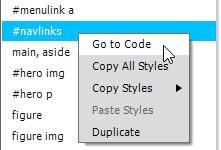
Right-click the#navlinksselector in the Selectors pane, and select Go to Code from the context menu (see Figure 9).


This opens Split View with the insertion point at the end of the selected style rule.
- Insert a new line above the
background-colordefinition, and add the following code:
background-color: #000000;
As soon as you type #, the color picker opens. Just press Enter/Return to close it. Dreamweaver inserts the hexadecimal code for black. Don’t forget a semicolon at the end of the line. The edited style rule should look like Figure 10.


Specifying the color twice like this takes advantage of the CSS cascade. The second value overrides the first in browsers that understand the RGBa format. Older browsers that don’t understand RGBa simply ignore the second definition, and apply a solid black background using the hexadecimal value.
- Close Split View by clicking the Live button.
- Create a descendant selector
#navlinks afor the links in the navigation menu, and set the following properties and values in the layout section:
display: block
padding-top: 10px
padding-bottom: 10px
- Click the
 icon to skip to the text properties, and set the following values:
color: white
font-weight: 400
text-decoration: none
text-transform: uppercase
The navigation menu now looks like Figure 11.


Although the navigation links are still in an unordered list, the styles have completely transformed the way they look.
Show and hide the navigation menu
The process of showing and hiding the menu is done using a combination of CSS and JavaScript. Whenever the trigger link is tapped or clicked, or the browser viewport is resized to less than a specified width, the JavaScript changes the name of a class applied to the unordered list of navigation links. The menu will be hidden only if JavaScript is enabled.
You’ll attach the JavaScript to the page later. First, let’s deal with styling the navigation menu in its displayed state.
- The navigation menu's position both when hidden and displayed is controlled by CSS absolute positioning. Highlight the
#navlinksselector in the Selectors pane of the CSS Designer, and set thepositionproperty to absolute (it’s in the layout section of the Properties pane, just beneath the padding visual tool).
As soon as you do so, the image of the Golden Gate Bridge jumps up behind the navigation links (see Figure 12).


This happens because absolutely positioned elements are removed from the normal document flow, and they float on a separate layer in front of the other elements.
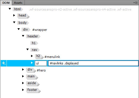
- In the DOM panel, add a class to the unordered list by double-clicking
#navlinksto open the field for editing. Type a space after#navlinks, followed by.displayed(beginning with a dot) as shown in Figure 13. Then click away to confirm the edit.


Although you could also use the Element Display to assign the class to the unordered list, this has the advantage of not automatically creating a selector in the Selectors pane of the CSS Designer.
- With
#navlinkshighlighted in the Selectors pane, click the plus button to create a new selector. Enter#navlinks.displayedin the editable field.
Make sure there is no space between#navlinksand the dot at the beginning of the class selector. This is not a descendant selector:#navlinks.displayedselects an element that has the ID navlinks and the class displayed.
- In the layout section of the Properties pane, use the visual tool below the position property to set top to 135px (see Figure 14).


Technically speaking, this sets the absolute position of the top of the unordered list to 135px from the top of its containing block. In this case, the page is the containing block, so it sets it 135px from the top of the page. You’ll learn more about absolute positioning in part 7.
- Also in the layout section, set
z-indexto 1, and opacity to 1.
To set thez-indexproperty, select value from the drop-down menu, and then type 1. This property sets the stacking order of positioned elements, and it ensures that the navigation menu won’t suddenly disappear behind anything else.
Theopacityproperty takes a value between 0 (fully transparent) and 1 (fully opaque). The menu will fade in and out at the same time as sliding in and out of view.
- Create a selector called
#navlinks.start, and set thedisplayproperty to none.
- Create a selector called
#navlinks.collapsed, and set the following properties and values:
top: –12em
opacity: 0
Setting the top property to a minus value moves the top of the unordered list out of view above the top of the page. With opacity at 0, it’s also invisible.
- To activate the menu, you need to attach the JavaScript file to the page. The file contains a function that looks for named IDs, so it needs to be attached after all the HTML has loaded. To insert the script in the right place, select the footer in Live View, then select Insert > HTML > Script.
- The script needs to go after the footer, so select After from the Position Assist Dialog. This opens the Select File dialog. Navigate to the js folder in the site root, and select menu.js, and click OK (Windows) or Open (Mac).
If all your style definitions and HTML are correct, the navigation menu should disappear from Live View. This is because the function in the JavaScript file changes the class on the navigation menu to start, setting thedisplayproperty to none. Then a fraction of a second later, it changes the class to collapsed, so the menu is ready to be displayed when the trigger link is clicked.
- Click MENU above the image of the Golden Gate Bridge, the navigation menu is displayed. Click again, and the menu disappears. Let’s make that a smoother transition.
- Right-click
#navlinksin the Selectors pane of the CSS Designer, and select Go to Code from the context menu.
- Add the following two lines of code just before the closing brace of the
#navlinksstyle rule (code hints will help you):
-webkit-transition: all ease-out 0.5s;
transition: all ease-out 0.5s;
This instructs the browser to transition all properties on the element and its descendants over half a second. The ease-out slows down the transition towards the end.
The edited style rule should look like Figure 15.


- Test the navigation menu again. This time it should slide in and out.
- With the navigation menu displayed, click the Home link to select it in Live View. Then click the plus button in the Element Display, and type
.thispagein the editable field to apply a class to the link.
Press Tab or Enter/Return to confirm the edit, but press Escape when the pop-up panel asks you to select a source for the style. You don’t want to create a selector because the style will be part of a much longer selector.
- Select
#navlinksa in the Selectors pane of the CSS Designer, and click the plus button to create a new selector. Enter the following group selector in the editable field:
#navlinks a:hover, #navlinks a:active, #navlinks a:focus, #navlinks a.thispage
This styles the navigation links in the:hover,:active, and:focuspseudo-classes, as well as the navigation link with the class.thispage.
- In the text section of the Properties pane, set the
colorproperty to#F68979. The Home link turns pink, as do the other navigation links when you hover over them.
- Save your work: File > Save All Related Files.
What might go wrong
Even if everything has gone well up to this point, the menu might not work. If that happens, the harsh truth is that you’ve made a mistake. Browsers (and Dreamweaver’s Live View, to some extent) are forgiving of mistakes in HTML. They’re also pretty good at handling the occasional mistake in CSS. That’s not the case with JavaScript. A single mistake, and it won’t work.
The script in menu.js uses what’s known as an IIFE (pronounced “iffy”), an immediately invoked function expression. What that means is that the function is executed immediately. It takes three arguments: the ID of the trigger link, the ID of the unordered list, and a number indicating the breakpoint at which the menu should be hidden when the browser viewport is resized. If you have given the elements different IDs or you have spelled them differently, the function won’t work. Nor will it work if you have spelled the names of the start, collapsed, and displayed classes. JavaScript is case-sensitive, so it treats menulink and menuLink as being completely different values.
Other things that might go wrong include mistakes in your CSS. There must be no space in the last three selectors you defined: #navlink.displayed, #navlink.start, and #navlink.collapsed. Also check that you didn’t forget to put a semicolon at the end of each line in the style rules you typed manually.
If you still can’t get the menu to work, compare your files with those in the part6 folder of the sample files. It doesn’t matter if the line numbers are different. Look for differences in code. Dreamweaver can be integrated with a third-party file comparison utility, which can make it easy to find differences. See the help files to learn more about setting up and using File Compare.
Don’t be discouraged by making mistakes. It’s an important part of the learning process. Even experts make mistakes. The difference is that experience teaches them how to spot and correct the mistake more quickly.
That completes the single-column design for the Bayside Beat website. The next stage is to adapt the design as a two column layout and give the navigation menu a different look.