Select the My Libraries tab from the menu bar at the beginning of the page.
Learn how to create visually accessible color themes on the web, save them to Creative Cloud Libraries, and then use them in your creative work.


Whenever you are designing for people you should be thinking about making it accessible for everyone. This applies to colors too. You might be surprised to know that Color Vision Deficiency, more commonly referred to as color blindness impacts between 3-8% of the world’s population. It is usually caused by certain genetics which makes it way more common in men than in women. In the Caucasian population, for example, it is estimated to affect around 1 in 12 men but only 1 in 200 women. This means that not everyone is going to experience the colors you pick in the same way. Understanding how users may perceive your color choices early will save you from having to go back to the coloring board to find new shades when you discover your designs aren’t working for everyone. Using Adobe Color’s accessibility color tools from the start allows you to find accessible colors directly on the color wheel.
Color blind safe themes


Accessible color themes won’t make a viewer with color blindness see the same colors as a normal viewer. Instead, think about it like this, if your original design requires every user to perceive five different colors then you need to make sure that all five colors are perceived differently. This is what we mean by a color blind safe theme. The Adobe Color accessible tools let you spot problems, help you keep as close to your original intent as possible, or discover new possibilities.
For people affected by color blindness, some specific combinations of hues and shades can lead to confusion, making such colors practically indistinguishable.
Deuteranopia and Protanopia are both types of the “red-green” color blindness, while Tritanopia is of the “blue-yellow” kind, with these color pairs referring to the potential conflicts for each kind of viewer. However, as you will quickly realize with our tool, this legacy language is an oversimplification of the actual problem, leaving many other potential conflicts traditionally untreated.
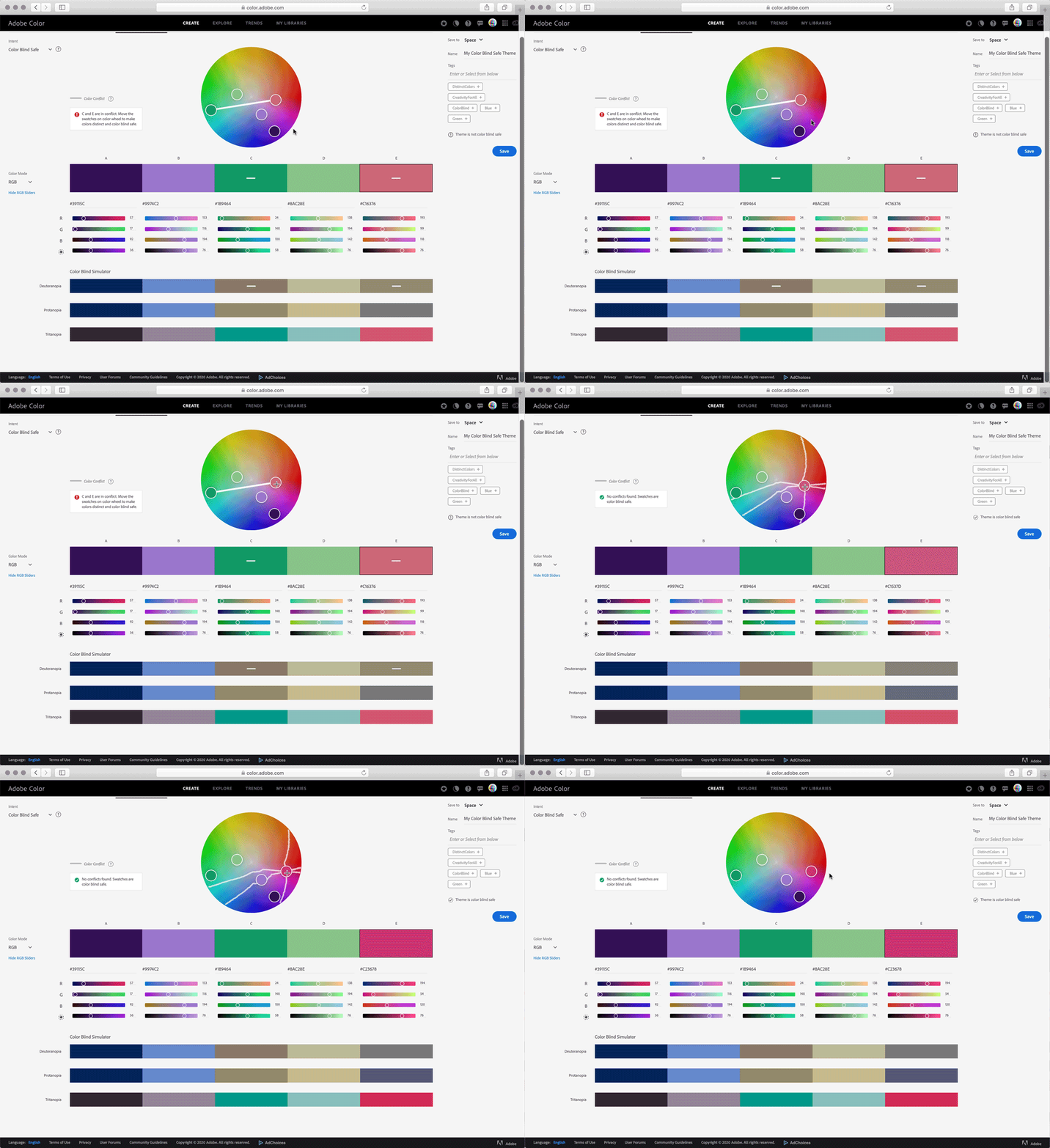
The accessible color wheel reveals issues for all three types of color blindness and below the wheel a simulated view is provided to show how your theme will appear to those affected by each type of color deficiency. Using the accessible color wheel, problematic color combinations are flagged by our conflict lines. These highlights which swatches may be indistinguishable to someone with color blindness. This allows you to create color palettes with five swatches that are distinct from each other for your entire audience. The degree of severity of the deficiency will vary from person to person, but the color wheel is designed to target all of them at once. Our simulated views show the strongest severity for each deficiency. The conflicts are labeled as “potential conflicts” to reflect that someone with a milder deficiency may not experience that same problem.
Create color blind safe themes
Create accessible color themes from the CREATE page by choosing the Accessibility Tools tab. You can create first on the Color Wheel tab or the Extract Theme tab and then select the Accessibility Tools tab to make adjustments or create your theme from start to finish on the accessible color wheel.


You can also edit any existing theme from your Libraries by tapping it to show the expanded view and choosing Edit in Accessibility View.


Conflict lines
Conflict lines will connect swatches that are not distinct from each other under at least one type of color blindness. Use the simulator below the color sliders to understand how colors will be viewed in all three types of color blindness. Conflict lines and simulation views are based on the highest severity for each color blindness type. You can easily resolve conflicts in a natural manner following the guidance over the color wheel by directly editing colors on it or using the sliders.


Conflict guides
Conflict Guides allow you to understand where problematic color combinations arise directly on the color wheel. Once you select a color puck to move, the conflict guides are activated to guide you into avoiding problematic regions for all types of color blindness. When the mouse is pressed down or the sliders are used the three guidelines emanating from the swatch (one for each type of color deficiency) help you avoid problematic color combinations for that color. By avoiding lines passing too close to another color puck, you will be able to find colors that are not in conflict quickly and intuitively. Safe distances from a line may vary depending on the region of the color wheel, so just keep moving the puck lines farther from other pucks until our conflict flags hyphens tell you when it is enough. Changing hue and saturation will open many new creative choices, but there will be situations where you may want to leverage brightness to fix a conflict. Use the corresponding slider to increase or decrease brightness of your current color until the conflict is resolved as indicated by the “hyphens”.


Saving color blind safe themes
When you save a theme without conflicts from the accessibility tools, it will automatically be tagged and displayed with a badge indicating it was created on our accessibility tools. This allows you to quickly see which themes are color conflict free when browsing your Libraries.
Finding your color blind safe themes
When you save a theme without conflicts from the accessibility tools, it will automatically be tagged and displayed with a badge indicating it was created on our accessibility tools. This allows you to quickly see which themes are color conflict free when browsing your Libraries on the Adobe Color website.


Find your created themes
-
-
Locate the name of the library you saved your color theme to and use the arrow to expand it.
-
Click the theme to open the expanded view where you can copy, download, edit, or delete your theme.
Using your color blind safe theme
Colors from the color theme will remain safe as long as they are not mixed with others. If they are mixed through blending or opacity changes, that will produce new colors that may not still be distinguishable to a color blind viewer. It’s best to use these colors in flatter design elements.
Finding your theme in desktop products
Accessible color themes can be used just like any other theme. You have many options to use your accessible color themes in desktop products. Find them in the Libraries panel of your favorite desktop apps, or if you use the Adobe Color themes extension in select desktop apps.


Once you locate your theme, simply click each swatch to set as the active color, or right click to add the entire theme to your swatches.
Finding your theme in mobile products
Your accessible color themes on mobile devices are located in the contextual color workflows.
In Adobe Fresco you can find your color themes in context to the color wheel:


-
Tap the color icon to open the Color panel.
-
Select the All tab.
-
Scroll to find the library that contains your theme.
-
Tap the Library to expand.
-
Tap the swatches in your theme to set the active color.