Learn how to use CSS to add animation effects to buttons on a page.


CSS transition properties enable you to add simple, yet elegant animated effects to your page. One way to improve the the user experience of a page is to add simple animations which help give the user feedback as they navigate your site. Common effects include a change in color, border, and size of the button or its text. The steps in this tutorial highlight the CSS used for the transition properties. Be sure to download the project files to follow along with these steps and view the complete code.
הפריטים הדרושים
This tutorial covers just some of what you can do with CSS transitions. Download the project files and try on your own now.
What makes a transition?
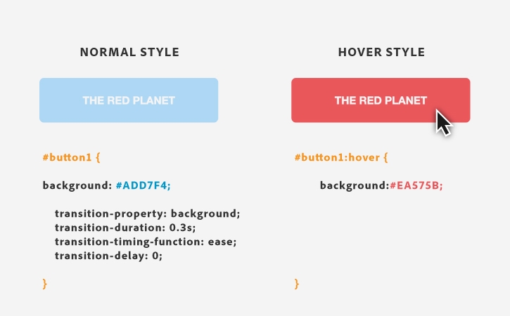
A transition effect on an object, such as a button, requires two different styles in CSS — one to style a button in its normal state, and one to style a button in its hover state (when a user mouses over it).
In this example, the style of the button in its normal state is defined in a CSS id selector (#button1). The style of the button in its hover state is defined in a pseudo selector (#button1:hover) for the same button. A pseudo selector defines a style for a specific state of an element such as when a user selects or hovers over a link.
In this case, the background color changes from a blue to a red. You include 4 transition properties to help customize the transition:
- transition-property: specify the CSS property to change (background)
- transition-duration: specify how long the transition will take (0.3s)
- transition-timing-function: specify if the transition effect will change speed over time (ease)
- transition-delay: specify a time before the transition will begin (0s)


Before you start
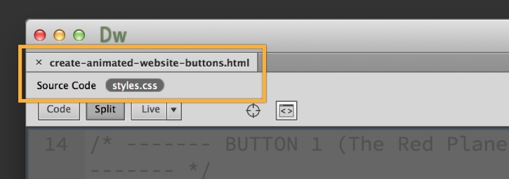
Open create-animated-website-buttons.html in Dreamweaver, and view style.css in Split view.
Color transition
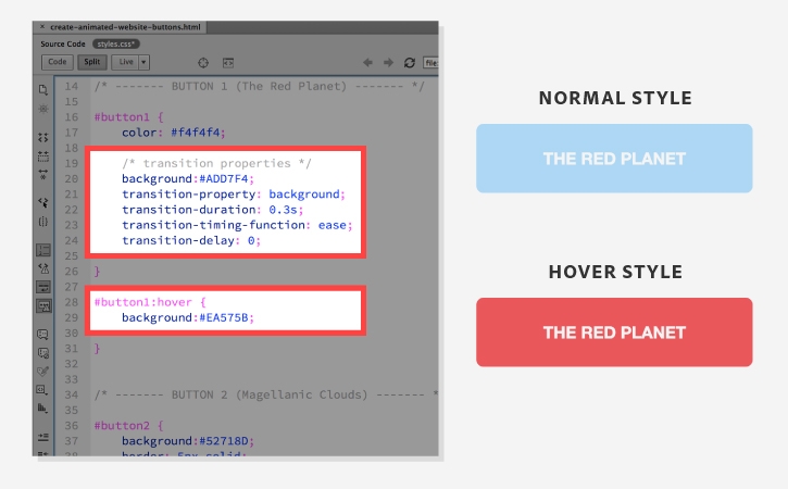
Set the styles in CSS to change the button from blue to red when the user mouses over it.
The CSS for the button in its normal state sets the background property to blue. The transition-property in the same CSS rule indicates the background color property will change when some action causes its state to change. The remaining transition properties determine how quickly and smoothly the change will occur.
- transition-timing-function: ease; causes the effect to start slowly, go faster, then end slowly.
The pseudo selector specifies that the button changes the background color to red when the user mouses over it and invokes the hover state.
CSS (Normal)
#button1 {
...
background:#ADD7F4;
transition-property: background;
transition-duration: 0.3s;
transition-timing-function: ease;
transition-delay: 0;
}
CSS (Hover)
#button1:hover {
background:#EA575B;
}

Border and text color transition
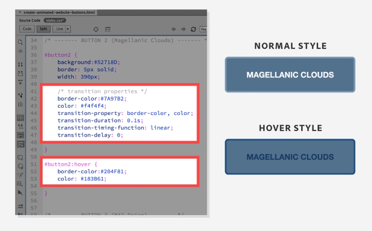
Set the styles in CSS to change the border and text color on the button.
The CSS for the button in its normal state sets the border-color property to light blue and the text color property to almost white. The transition-property in the same CSS rule indicates the border-color and text color properties will change when some action causes its state to change. The remaining transition properties determine how quickly and smoothly the change will occur.
- transition-timing-function: linear; causes the effect to have the same speed from start to end.
The pseudo selector specifies that the button changes the border-color and the text color to dark blue when the user mouses over it and invokes the hover state.
CSS (Normal)
#button2 {
...
border-color: #7A97B2;
color: #f4f4f4;
transition-property: border-color, color;
transition-duration: 0.1s;
transition-timing-function: linear;
transition-delay: 0;
}
CSS (Hover)
button2:hover {
border-color: #204F81;
color: #183B61;
}

Size transition
Set the styles in CSS to change the size of the button.
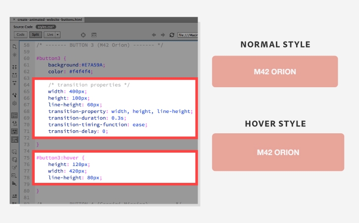
The CSS for the button in its normal state sets the width property to 400px, the height property to 100px, and the line-height 60px. The transition-property in the same CSS rule indicates the width, height, and line-height properties will change when some action causes its state to change.
The pseudo selector specifies that the button changes the width, height, and height to larger values, so the button gets bigger when the user mouses over it and invokes the hover state.
CSS (Normal)
#button3 {
...
width: 400px;
height: 100px;
line-height: 60px;
transition-property:
width, height, line-height;
transition-duration: 0.3s;
transition-timing-function: ease;
transition-delay: 0;
}
CSS (Hover)
#button3:hover {
width: 420px;
height: 120px;
line-height: 80px;
}

Background and text color change
Set the styles in CSS to change the background and text colors of the button.
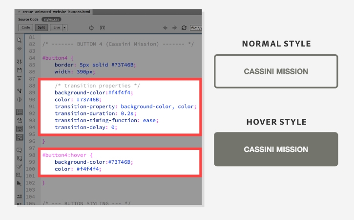
The CSS for the button in its normal state sets the background-color property to almost white and the text color property to gray. The transition-property in the same CSS rule indicates the background-color and text color properties properties will change when some action causes its state to change.
The pseudo selector specifies that the button changes the background-color and text color properties to inverse values when the user mouses over it and invokes the hover state.
CSS (Normal)
#button4 {
background-color:#f4f4f4;
color: #73746B;
transition-property:
background-color, color;
transition-duration: 0.2s;
transition-timing-function: ease;
transition-delay: 0;
}
CSS (Hover)
#button4:hover {
background-color:#73746B;
color: #f4f4f4;
}

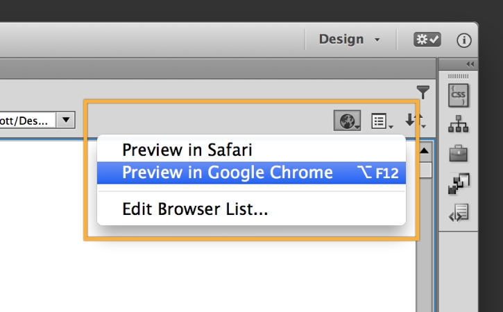

Click Preview in Browser and choose your preferred browser to see the transitions.
Save your files first, in order to view the recent changes.