Create a chart that draws itself onscreen by applying multiple strokes to a shape layer and animating their paths in Adobe After Effects.


De ce veți avea nevoie
This sample file is an Adobe Stock asset you can use to practice what you learn in this tutorial. If you want to use the sample file beyond this tutorial, you can purchase a license on Adobe Stock. Check out the ReadMe file in the folder for the terms that apply to your use of this sample file.
Trim paths give you the ability to use a single shape layer and a few keyframes to generate a complex animation. Our sample doughnut (donut) chart uses a single circle that’s segmented with Trim Paths modifiers — but you could apply this technique to a different graph type, such as a stacked bar chart with overlapping colors.
Create a shape layer and add it to a blank composition. For a doughnut graph, you’ll want to create a circle, so hold down Shift while dragging with the Ellipse tool. Command/Control-click the Pan Behind tool (press Y) to automatically center the shape’s anchor point. Twirl open the layer’s Contents folder, turn on the Stroke 1 layer (click its eyeball) if it’s not already visible, and then set Stroke Width to something high so you can see it. Pick a stroke color and then turn off or delete the Fill 1 layer.
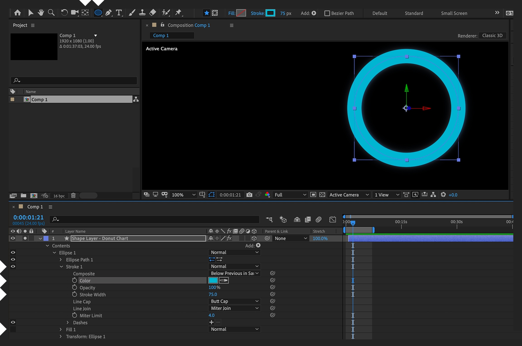

With the Ellipse 1 layer (not the entire shape layer) selected in the timeline, click the small Add button in the Switches column and choose Trim Paths in the pop-up menu. (You may need to click Toggle Modes/Switches at the bottom of the Timeline panel to see the Add button.) Under Contents, twirl open the Trim Paths 1 option and set keyframes for the End parameter, one at 0% at the start of the comp and one at 100% a few seconds later. Preview your animation to see a circle draw itself on the screen.
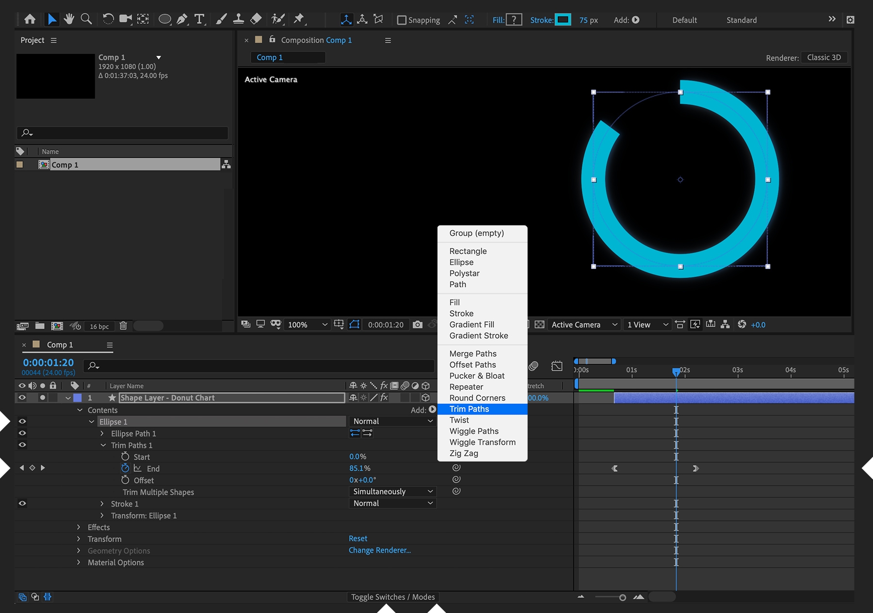

A doughnut chart, like a pie chart, shows the relationship of segments to a whole. Right now, you’ve got one value that goes to 100% — like a pie chart without any slices — so add some segments to the chart. Select the Ellipse 1 layer (not the Ellipse Path 1 layer) and choose Edit > Duplicate a few times to add more ellipse layers (i.e., circles) to the comp. Each ellipse layer has its own Stroke and Trim Paths instances. Change the Color value of each Stroke layer and modify the End keyframe of each Trim Paths modifier. The data you’re representing with this chart should match the End percentages for each category. Preview your animation and see each data segment animate simultaneously along the same path.


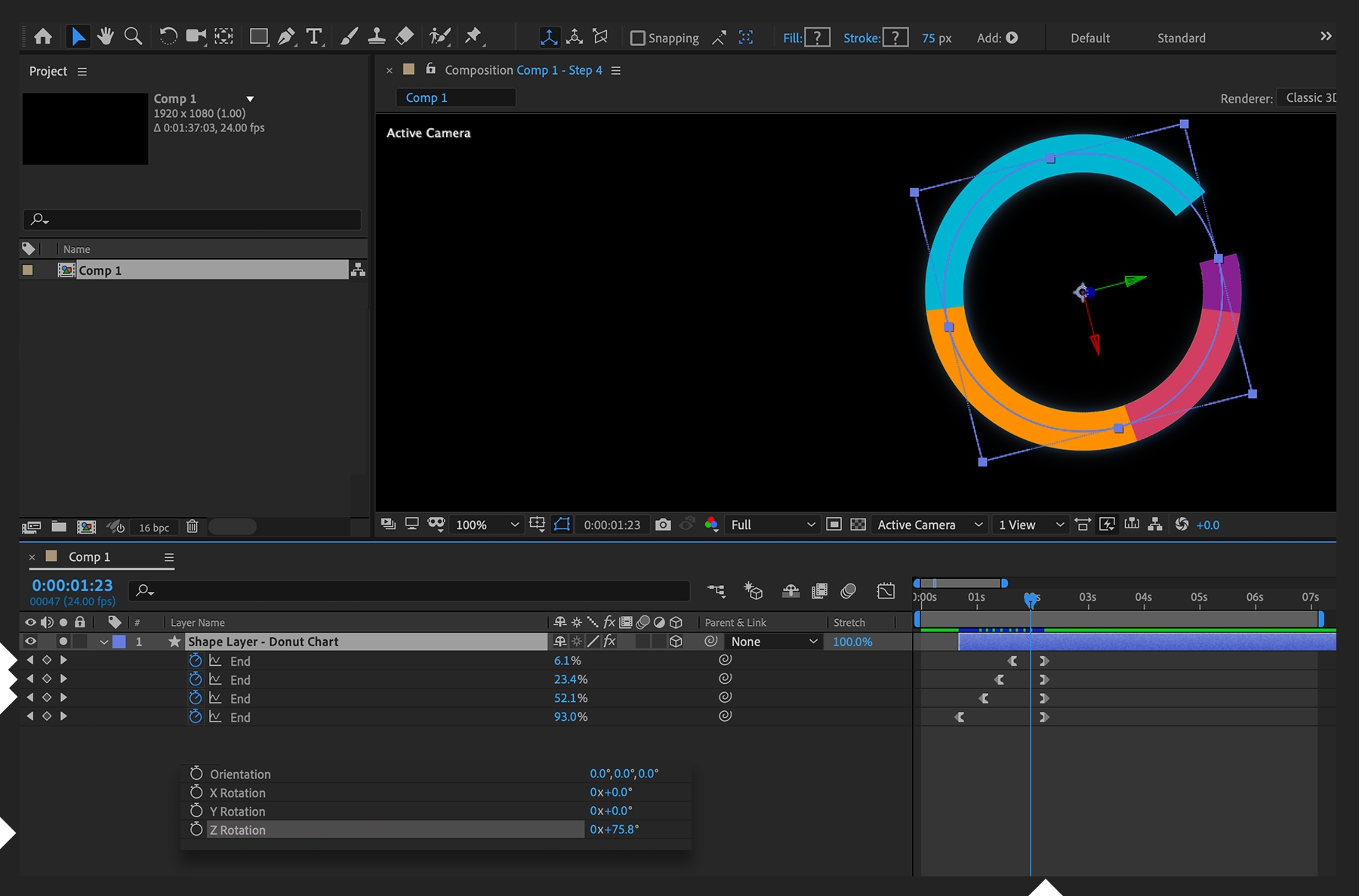
Finesse the timing of how each segment grows. With your shape layer selected, press U on the keyboard to show only the keyframed parameters. Offset the starting keyframe of the End value for each layer by a few frames. For best effect, start the bottommost segment first and start the topmost segment last. All of them should finish their End value simultaneously. Preview your animation and watch how each segment now offsets the start of its animation but ends at the same time. For added interest, change the shape layer’s Z Rotation value (press R) so the shape starts drawing from somewhere other than the very top.

To add a second data series, all you need to do is duplicate the entire shape layer, scale it down, remove all but one Ellipse layer within Contents, change its color and stroke width, and modify both the Start and End percentages so it lines up with the data points you wish. To add chart labels, start a new composition and drag your chart comp into it. Use the Text tool to add labels to the chart and animate up their opacity sequentially so they’re timed to meet each segment of the chart. Create a new solid layer for your background and drag a background graphic image on top of your background but below your nested chart comp. You can see what we did here. Go ahead and play with the sample chart we’ve provided.
With Adobe Stock, you have access to more than 100 million high-quality, royalty-free images including photos, graphics, videos, and templates to jump-start your creative projects. Try Adobe Stock and get 10 free images.