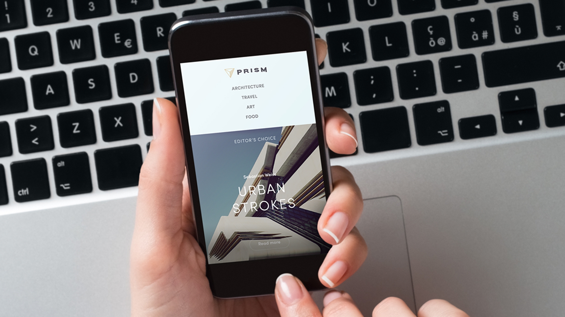
Style the menu to make it easy for visitors to navigate your site on any type of device — mobile, tablet, or desktop.


De ce veți avea nevoie
1. Create a menu structure
See why a mobile-first approach to web design is a good idea. Define a site to manage your files and assets, and then use HTML to create a header section that includes the logo and basic structure of your navigation.
2. Style the menu for mobile
As of now, the main menu is a bulleted list with purple text. Let’s style it with CSS and adjust the layout for mobile screens.
3. Style the menu for tablet and desktop
The menu layout will be different across mobile, tablet, and desktop screens. Find out how to use CSS media queries to change the layout for different devices. As a bonus, see how you can do real-time design while previewing on an actual device.