In the seventh part of this series, learn how to use CSS media queries to change the layout from two columns to one when viewed on phone and tablet browsers.


De ce veți avea nevoie
Note: The downloads include the complete set of Creative Cloud Libraries and project files for this tutorial series. You can continue to build on your starting file in Part 1, or navigate to the relevant folder to use the starting file for each section.
Introduction
Welcome to part 7 of this tutorial series about building a simple, responsive website with Dreamweaver 2015. The finishing line is in view. All that remains is to complete the second page, and then to adapt the single-column layout of the Bayside Beat website (see Figure 1) to a two-column design suitable for tablets and desktops.


The way you deliver a different layout to larger screen resolutions is by using CSS media queries. A media query tests delivers different style rules to the browser depending on certain criteria, such as the minimum or maximum width of the viewport. To keep things relatively simple, you’ll create just two media queries, one to display the page as a two-column layout when the screen is at least 700px wide, and another to flow text around some images when the screen is at least 900px wide. By the end of this part, the home page will look like Figure 2.
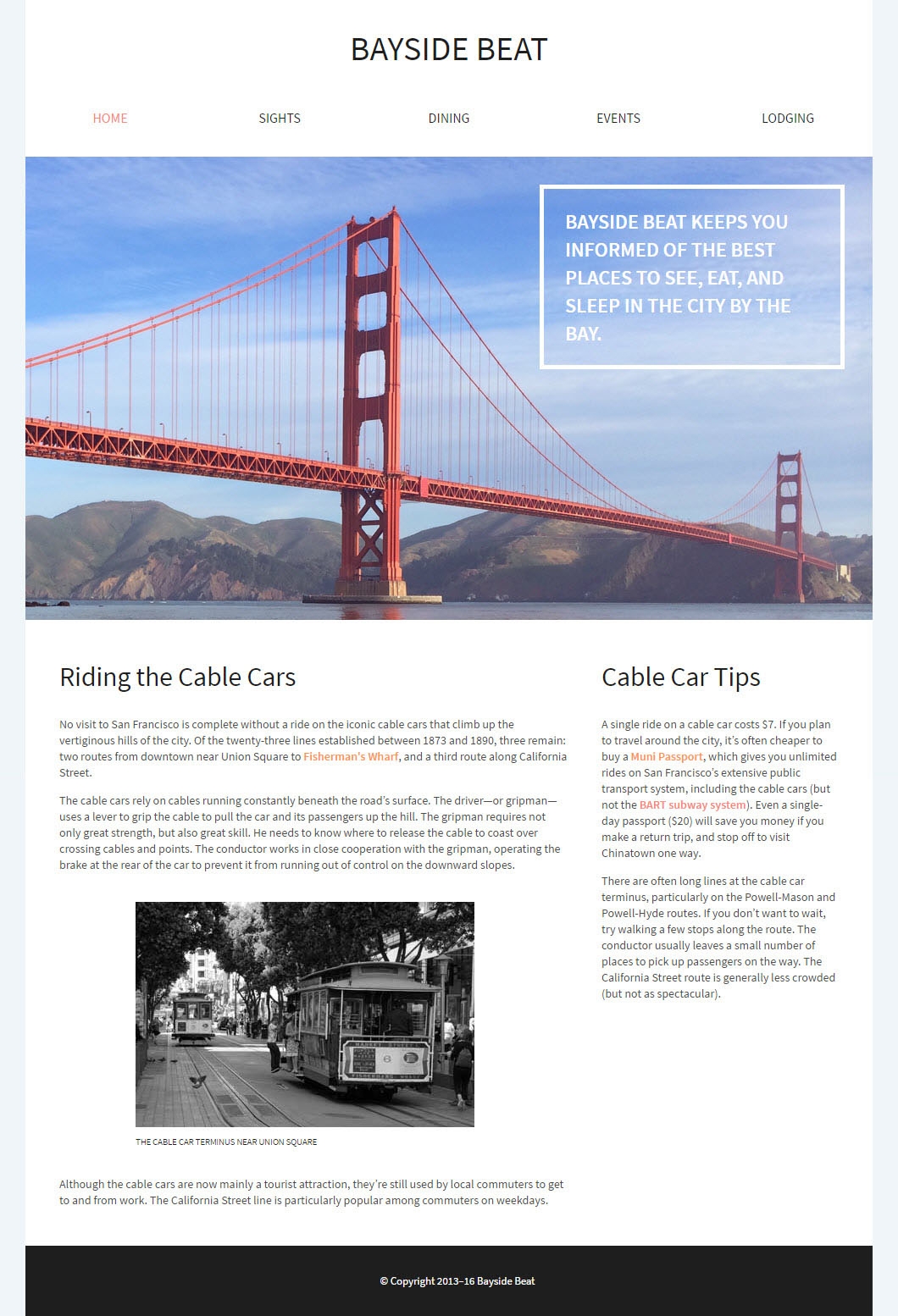

In the process, you’ll learn how to avoid problems with absolute positioning. But first of all, you need to do some work to the second page, which is currently unstyled.
Style the second page
The great thing about using an external style sheet is that the styles are immediately applied to every page that’s linked to it. After linking the style sheet to sights.html, you need to update the navigation menu in the second page.
- Open sights.html in the Document window by double-clicking it in the Files panel.
- Switch to the CSS Designer, click the plus button (+) at the top-left of the Sources pane, and select Attach Existing CSS File (see Figure 3).
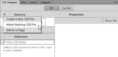

- Click the Browse button in the dialog box that opens, and navigate to responsive.css in the styles folder. Click OK (Windows) or Open (Mac), and then click OK to close the first dialog box.
Attaching the style sheet immediately transforms the look of the page. Dreamweaver also detects that the styles use an Adobe Edge Web Font, and inserts the code to download it.
- The navigation menu still looks like an unordered list. In the DOM panel, select the unordered list (it’s nested inside the header and nav elements). Edit the ul element by double-clicking, and type #navlinks .displayed in the right-hand field. Code hints will pop-up for both the ID and class (see Figure 4).
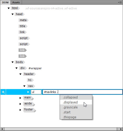

The navigation menu is restyled and absolutely positioned over the first heading and subsequent paragraphs. If Live View is wider than 1000px, don’t worry about the semi-transparent background spilling out of the wrapper <div>; on the right. This won’t be visible in the two-column layout.
- Expand the
ulelement in the DOM panel, then expand the secondlielement, and select theaelement nested inside. You can check that you have selected the correct element because the SIGHTS link will also be selected in Live View.
Double-click theaelement in the DOM panel, and assign thethispageclass to it (see Figure 5).
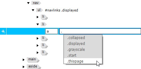

When you press Enter/Return to confirm the edit, the class is also displayed in the Element Display, and the second link changes color (see Figure 6).


- To complete the navigation menu, you need to add the trigger link and the JavaScript file. There are several ways to do this, but since you're working in the DOM panel, let's continue to do so.
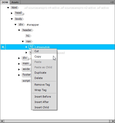
Make index.html the active page in the Document window, right-clickh2 #menulinkin the DOM panel, and select Copy from the context menu (see Figure 7).

- Return to sights.html, select the
navelement in the DOM panel, right-click and select Paste as Child.
Caution: If you click Paste instead of Paste as Child, the trigger link will be inserted as a sibling of the nav element (in other words, at the same level of the HTML hierarchy), so it will be below the ul in the DOM panel. However, it will appear to be in the correct position in Live View because the unordered list is absolutely positioned and therefore removed from the normal document flow.
Check the DOM panel to make sure thath2 #menulinkis correctly nested inside thenavelement above the unordered list, as shown in Figure 8.


If h2 #menulink is below the unordered list, undo by pressing Ctrl+Z (Windows) or Cmd+Z (Mac). Then reselect the nav element, right-click and Paste as Child.
- Switch back to index.html, right-click the
scriptelement at the bottom of the DOM panel, and select Copy from the context menu.
- Return to sights.html, right-click the
footerelement in the DOM panel, and select Paste from the context menu.
This time, you want Paste, not Paste as Child. The script should be after the footer, not nested inside.
When the script is attached, the navigation menu is hidden in the same way as in index.html. If the Document window is wider than 1000px, attaching the script might cause the wrapper to shift to the left in Live View. If that happens, just press F5 to refresh the page.
- Save sights.html.
Rather than copying the unfinished version of the navigation menu in part 3 and updating it here, you would be justified in thinking that it should have been finished first. In practice, web development rarely goes smoothly. You, or your client, may have new ideas or requirements, so it's important to know how to copy elements to other pages. This has also been an exercise in making sure elements are nested correctly. This page would continue to work even with the script nested in the footer, but incorrectly nested code will often cause problems. Troubleshooting is much easier with well organized code.
Fix the font in the trigger link
In the previous section, you switched back and forth between index.html and sights.html several times. If you were very observant, you would have noticed an difference between the trigger link in the two pages. The text of MENU in index.html is a lighter weight than in sights.html (see Figure 9).
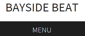

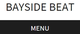

This has happened because the font for the body is declared as source-sans-pro with a font-weight of 400 (normal). When you created this style rule in part 4, Dreamweaver initially set the font-weight to 200 (light). As a result, the script that loads the Adobe Edge Web Font in index.html downloads both weights. But when you attached the style sheet to sights.html, Dreamweaver saw source-sans-pro only with the normal font-weight. To fix this, you need to make an adjustment to styles that use a different weight.
- With sights.html as the active page in the Document window, select
#menulinka in the Selectors pane of the CSS Designer.
- If necessary, deselect Show Set in the Properties pane, click the
 icon to skip to the text properties, and set
 font-familyto source-sans-pro. This updates the script in the<head>section that downloads the Edge Web Fonts.
- Switch to index.html, and select the style rule for
#hero pin the Selectors pane of the CSS Designer. This declares thefont-weightat 600. Because it's heavier than the normalfont-weight, browsers (including Live View) synthesize the font as semi-bold, but this isn't what you really want. Setfont-familyfor this rule also to source-sans-pro. The text in the paragraph is now much crisper.
- You’ve made changes to several files, so select File > Save All.
- Dreamweaver asks if you want to update the Web Fonts in sights.html (see Figure 10).
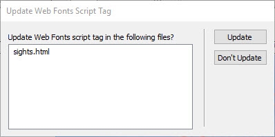

- Click Update, then click Close to dismiss the dialog box that reports the update has been done. Dreamweaver automatically saves the file(s) it has updated.
Usually, the only time you need to specify the font-family in a style rule other than the body is when you want to use a different font. However, in this case, you're using an Edge Web Font that has to be downloaded from Adobe’s servers. To keep the download size to a minimum, Dreamweaver fetches only those weights it knows are being used. Although semi-bold (600) is used only in index.html, the extra font-weight will be stored in the browser’s cache when visiting sights.html, so it's unlikely to cause an extra burden. However, if you're using many web fonts (not a good idea, incidentally), you should think more carefully about downloading fonts that won't be used.
Insert images from a local source
In part 5, you inserted images in <figure> elements directly from the Bayside CC Library. More often than not, though, you'll be working with images that are stored locally. In this section, you'll add two images to sights.html using different methods. The process is very similar to part 5, so the instructions are kept to the minimum.
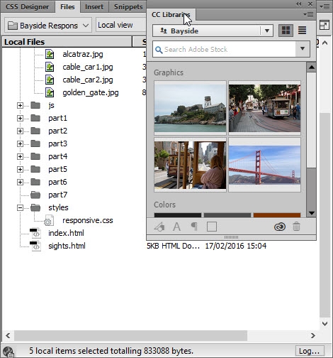
- In the CC Libraries panel, right click the image labeled alcatraz, and select Download Unlinked from the context menu.
- In the dialog box that appears, change the image format to JPEG, and resample the image to 400 x 266.
- Repeat the previous two steps to download the image labeled cable_car2. Because you defined images as the default images folder in part 1, both images are extracted from the CC Library and downloaded to the images folder in the Bayside Responsive site.
- In sights.html, select the first paragraph (it begins with "The precipitous hills…") in Live View.
- In the HTML section of the Insert panel, select Figure to insert a
<figure>element with a nested<figcaption>. Select After from the Position Assist Dialog.
- With the
<figure>element still selected, use one of the following methods to insert cable_car2.jpg:
- Click Image in the HTML section of the Insert panel.
- Select Insert > Image.
- Use the keyboard shortcut Ctrl+Alt+I (Windows) or Cmd+Opt+I (Mac).
- Select Nest from the Position Assist Dialog, and select cable_car2.jpg from the dialog box that opens.
- Use the Quick Property Inspector to remove the width and height from the image. Delete the placeholder text for the
<figure>element, and replace the caption placeholder text with The front seat of a cable car affords a great view of the city.
- Insert a
<figure>element with<figcaption>between the third and fourth paragraphs.
- Although you can't drag and drop a local image from the Files panel, you can from the Assets panel, which is docked with the DOM panel by default in the Design workspace.
Open the panel by clicking its tab, and make sure the Images icon is selected at the top-left (see Figure 11).
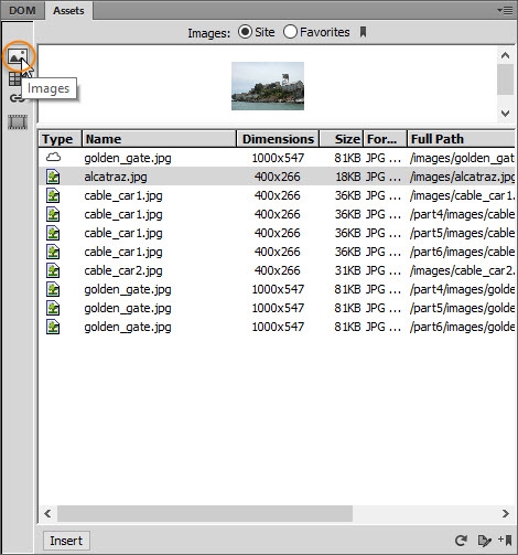

If necessary, refresh the panel contents by clicking the circular arrow at the bottom-right. You can also increase the size of the preview pane by dragging its bottom edge down.
- Select alcatraz.jpg either in the list of filenames or in the preview pane, and drag it into Live View. In the same way as you did in part 5, drag the image until you see a green line just above the
<figure>element, pause, and move the mouse pointer over the</>icon that appears. Then continue dragging in the floating DOM panel, and release the mouse button when the mouse pointer is on top of the figure element (see Figure 12). This nests the image inside the element.
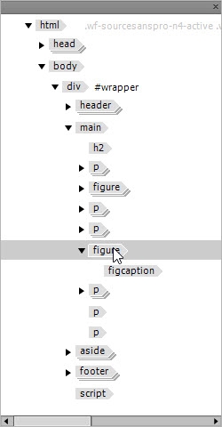

- Use the Quick Property Inspector to remove the image’s width and height. Delete the placeholder text for the
<figure>element, and replace the caption with Alcatraz—former exclusive residence for notorious criminals.
- Select the image of Alcatraz, and use the Element Display to apply the
grayscaleclass to it (don’t forget the initial dot that indicates you’re assigning a class).
- Save sights.html.
Add a media query to style the site for tablets and desktops
Media queries are a relatively new feature in CSS, but they’re supported by all modern browsers. The only notable exceptions are Internet Explorer 8 and earlier, but they’re no longer officially supported by Microsoft, so the number of people using such old browsers is rapidly diminishing. The great advantage of media queries is that they let you serve different sets of CSS to browsers depending on certain features, such as the width of the screen, orientation, pixel density, and so on. To keep things simple, you’ll create just two media queries, both based on the minimum width of the screen.
- You don’t need the CC Libraries panel any more, so drag its tab next to the Snippets panel in the panel group on the right (see Figure 13). Move it towards the top of the panel group until a blue line appears. Then release the mouse button to dock it with the other panels.

- Drag the Live View scrubber until the Document window is approximately 700px wide. The exact size isn’t important, nor does it matter whether index.html or sights.html is the active document.
- Click the
 icon in the ruler at the top of the Document window to open the pop-up panel where you set a media query (see Figure 14).
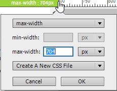

- Change the top drop-down menu to min-width, set the value of the min-width field to 700px, and select responsive.css from the last drop-down menu. Check that your settings are the same as in Figure 15, and click OK.
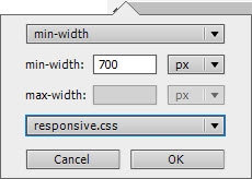

- The Visual Media Queries bar at the top of the Document window now has a purple bar. Click this bar to make the Document window exactly 700px wide.
- In the CSS Designer, make sure the All button is selected at the top. Select responsive.css in the Sources pane, and expand the @Media pane. The media query is now listed here. When you select it, the Selectors pane is empty (see Figure 16).
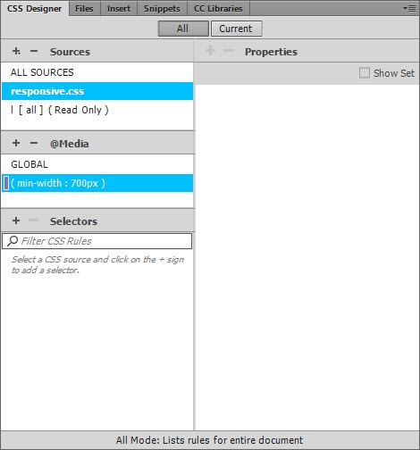

- Click GLOBAL in the @Media pane. All the selectors that you created in parts 4–6 are listed here. These styles will be applied by all browsers regardless of screen width. You use the media query to change only those values that you want to override when the screen is at least 700px wide.
- Save your work by selecting File > Save All Related Files.
The real value of the Visual Media Queries bar becomes apparent when you’re working with multiple media queries. The top row shows max-width queries as green bars, the middle row shows queries with both a minimum and maxium as aqua bars, and the bottom row shows min-width queries as purple bars. Clicking the appropriate bar resizes the Document window allowing you to view the effect of your different style rules. Check the online documentation for more details about the Visual Media Queries bar.
Style the navigation menu for the two-column layout
The navigation menu will be displayed at all times in the two-column layout. By now, it’s assumed you know how to create selectors and style rules, so these instructions will be kept relatively brief.
- Make sure the Document window is at least 700px wide. It doesn’t matter whether index.html or sights.html is the active file. Click anywhere in the navigation trigger link in Live View to select it.
- In the CSS Designer, make sure the All button is selected, select responsive.css in the Sources pane, and (min-width: 700px) in the @Media pane. The Selectors pane should be empty (see Figure 16).
- Click the plus (+) button in Selectors pane, and create a selector for #menulink. In the layout section of the Properties pane, set the display property to none. The menu trigger link disappears.
- Drag the Live View scrubber left to make the page narrower than 700px. The trigger link reappears. Drag back in the opposite direction, the link is hidden again as soon as the page is 700px wide.
- Make sure the media query is still selected in the @Media pane (this also applies to all subsequent changes), create a selector for #navlinks, and set the following properties and values:
max-width: 1000px
position: static
background-color: transparent
Changing the position property to static means that the unordered list of navigation links is no longer absolutely positioned, and is displayed in its normal position within the page, forcing the rest of the page content to drop down. You can’t see the links yet because the collapsed class has been applied dynamically by the JavaScript in menu.js.
- Create a selector for #navlinks.collapsed (no space around the dot), and set the opacity property to 1. The menu reappears, but only the thispage link is visible because the background-color was set to transparent in the previous step. White links on a white background are impossible to see!
- Fix the links by creating a selector for #navlinks a, and set the following properties and values:
width: 20%
margin-bottom: 20px
padding-top: 15px
padding-bottom: 15px
float: left (it’s the first icon for this property)
color: #1E1E1E
The navigation menu now looks like Figure 17.


There are five links in the navigation menu, so setting the width of each one to 20% and floating them to the left spreads them evenly across the page. Setting the max-width property to 1000px in step 5 prevents them from spilling out of the wrapper <div>.
The float property is currently the most reliable way of aligning block-level elements horizontally. Although links aren't normally block-level, their display property was set to block in the global styles created in parts 4–6.
Use absolute positioning to place text over an image
In part 5, you styled the paragraph under the image of the Golden Gate Bridge in a semi-bold pink font with a bottom border. For the two-column layout, you’ll use absolute positioning to place it over the image, and style it in a different color with a border on all sides. You’ll also learn how to avoid a common mistake with absolute positioning.
- If necessary, switch to index.html, and click the purple bar in the Visual Media Queries bar to set the width of the Document window to 700px.
If the ruler at the top of the page appears to be incorrectly set, close index.html and reopen it. The JavaScript that controls the navigation menu on screens less than 700px wide sometimes shifts the ruler.
- In Live View, select the paragraph under the image of the Golden Gate Bridge. Make sure that responsive.css and the media query are still selected in the CSS Designer, create a selector for #hero p, and set the following properties and values:
width: 36%
padding-top: 20px
padding-left: 25px
padding-right: 25px
position: absolute
When you set the position property to absolute, the "Riding the Cable Cars" heading and following text move up behind the paragraph that you're styling. Absolute positioning removes an element from the normal document flow and places it on a layer in front of other elements.
- Use the visual tool immediately below the
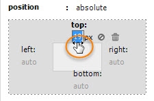
positionproperty to move the paragraph into position over the image of the Golden Gate Bridge by setting the top and right offsets. Setting a positive value for an offset moves that side of the element away from the same side of the element’s containing block.
This is a good opportunity to use the scrubbing technique described in part 5. After selecting px as the unit of measurement, position your mouse pointer over or just under the value until the cursor turns into a double-headed arrow (see Figure 18), and then drag to the right to increase the value or left to decrease it.

- Set the
colorproperty to white, and set the border on all sides to 5px wide and solid. Figure 19 shows how the paragraph should now be positioned over the Golden Gate Bridge.
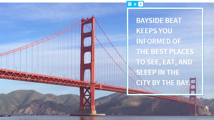

- Double-click the gray area to the side of Live View to make it fill the entire width of the Document window. Depending on how large your monitor is, the result will vary from bad to very bad (see Figure 20).
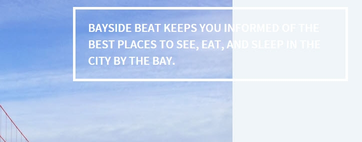

Most people’s initial reaction is that their absolutely positioned element has moved. It hasn’t. The offsets from the top and right are still exactly the same. The problem is that the offsets are calculated from the positioned element’s containing block. Wait a moment, it’s nested inside the hero <div>. Surely that’s its containing block?
It’s a natural assumption, but the CSS specification says that the containing block of a positioned element must also be positioned. When there’s no such element, the page becomes the containing block. As a result, the 36% width is relative to the page rather than the hero <div>, and the offsets are calculated from the top and right of the page.
- Fixing this problem is remarkably easy. Create a new selector for
#hero, and set its position property to relative. This makes the parent<div>the containing block for the absolutely positioned paragraph, and the offsets are no longer calculated from the top and right of the page.
- Adjust the position of the paragraph by selecting the
#hero pselector, and resetting thetopproperty to approximately 90px. At full width, the hero image should look like Figure 21.
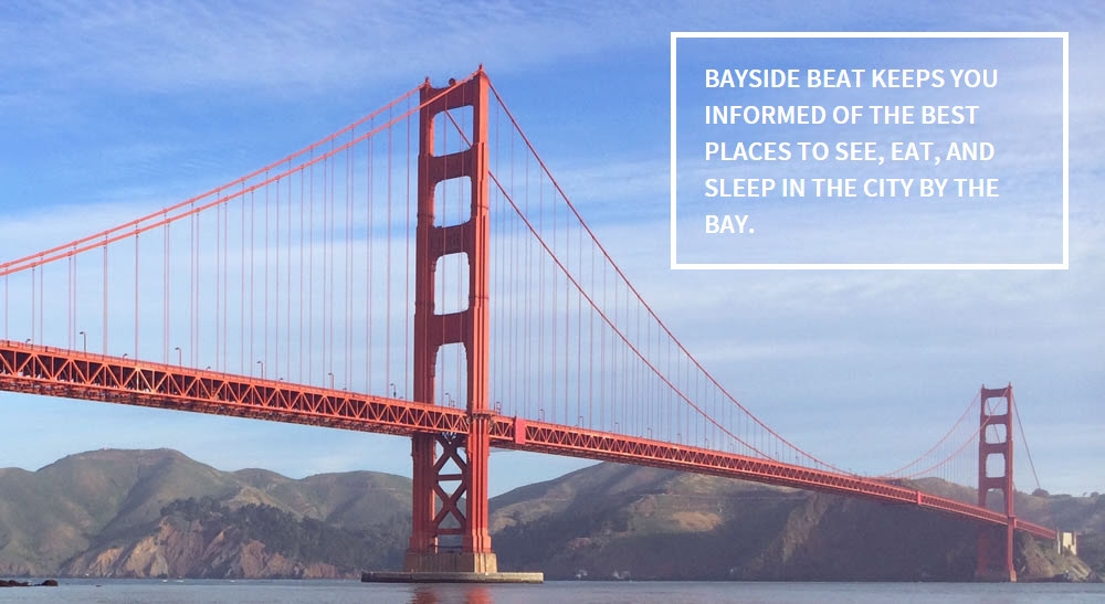

At 700px, the text should still be in the same position at Figure 19.
- Save your work by selecting File > Save All Related Files.
Setting an element’s position property to relative allows it to be offset against its normal position in the page without affecting the surrounding elements. In this case, no offsets are specified for the hero <div>, so it doesn’t move. However, because it’s a positioned element, it acts as the containing block for the absolutely positioned paragraph. It might seem strange, but that’s the way absolute positioning works.
Using absolute positioning in combination with relative positioning is useful for individual tasks, such as positioning text over an image like this, but it’s rarely, if ever, a wise choice for trying to lay out a complete web page. The web is a fluid medium.
Float one column alongside another
Earlier, you used the float property to align the navigation links horizontally. Using the same property is currently the most reliable way of creating a two-column layout. When an element is floated left or right, it moves to that side, allowing following elements to move up alongside into the vacated space. For elements to float, they must have a declared width or max-width.
- With responsive.css and the media query selected in the CSS Designer, create a selector for main, and set its width property to 60%.
- Create a selector for aside, and set its width property to 28%. Also set the left margin to 0px. This is necessary to override the 4% margin that it inherits from the global styles.
The <main> element inherits a 4% margin on both sides from the global styles, and the<aside>element still has a 4% margin on the right. So the combined width of the two elements and their horizontal margins adds up to exactly 100%.
- Create a group selector for
main, aside. Set the following properties and values:
margin-top: 30px
margin-bottom: 30px
float: left
font-size: 0.875em
As soon as you set the float property, it will look as though disaster has struck because most of the background turns black (see Figure 22).
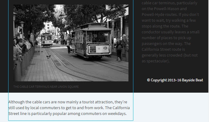

This is perfectly normal. Floated elements are removed from the main flow of the document in a similar way to absolutely positioned ones. What has happened is that the <footer> element has also moved up alongside the <main> element, and its background has filled in the space vacated by the floated elements. The fix is easy.
1. Create a selector for footer, and set the clear property to left. Everything falls back into place.
There is another technique called flexbox that could be used for the two-column layout. It’s supported by all modern browsers. Unfortunately, many browsers still in use implemented older versions of the flexbox properties, making reliable cross-browser implementation difficult.
Flow text around images
The original purpose of the float property was to flow text around images. So, let’s complete the design by creating a second media query and flowing text around the images in sights.html when the browser viewport is greater than 900px.
- Switch to sights.html, and use the Live View scrubber to resize Live View to approximately 900px.
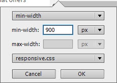
- Click the
 icon in the ruler, and create a media query for
 min-width: 900pxin responsive.css (see Figure 23 for the settings).

- Click to the right of 900px in the Visual Media Queries bar to reset the width of Live View to 900px.
- Select the cable car image at the top of sights.html, and press the up arrow once to select its parent
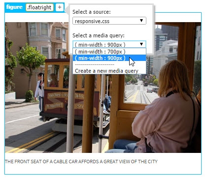
<figure>element. Click the plus (+) button in the Element Display. Type.floatrightin the editable field, and press Tab or Enter/Return to assign the class. In the pop-up panel, make sure that responsive.css is selected, and then select themin-width: 900pxmedia query from the second drop-down menu (see Figure 24).

- In the CSS Designer, select the
min-width: 900pxmedia query in the @Media pane, and then select.floatrightin the Selectors pane. Set the following properties and values for the class:
float: right
margin-right: 0px
margin-left: 10px
This flows the text in the following paragraph around the left side of the image and caption (see Figure 25).
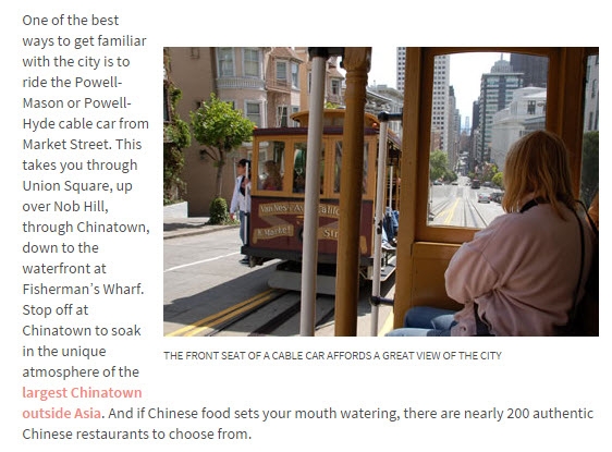

If the image doesn’t move to the right, it probably means you applied the class to the image itself rather than its parent <figure> element.
- Repeat steps 4 and 5 with the image of Alcatraz, this time creating a class called
.floatleftwith the following values:
float: left
margin-right: 10px
margin-left: 0px
- Save your work by selecting File > Save All Related Files.
Set the viewport meta tag
Your responsive design is complete. There's just one final step before your masterpiece can be displayed correctly on mobile devices.
In the HTML category of the Insert panel, select Viewport (see Figure 26). It's in the third section roughly two-thirds of the way down.
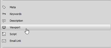

You need to do this in both sights.html and index.html (and any other responsive page). This is because mobile phones automatically scale pages and ignore media queries without it.
Where to go from here
It’s taken a lot of effort to get this far, but in the process, you have learned a lot not only about how to use Dreamweaver 2015, but also about the current state of web design. If you found some techniques difficult, go back over those parts again. It isn’t hard to learn the basics of HTML and CSS, but web design is becoming increasingly sophisticated. Don’t expect to become an instant expert. Many people from a graphic design background miss the point when they insist that they’re designers, not coders. Building a website is designing, but you’re designing with code. Dreamweaver writes most of the code for you, but you need to know which CSS properties and values you need to achieve your desired effect.
If you need help with layout and design problems, upload your problem page to a website, and post a question in the main Dreamweaver Support Forum. Include the URL and a brief description of the problem in your post. You’ll often find several people will come to your assistance.
You’ll learn how to upload your web pages and other assets to a live web server in the final part of this tutorial series.