Learn the basics of Cascading Style Sheets (CSS) and about the tools available in Dreamweaver for applying CSS to add style to web pages.


المتطلبات
Dreamweaver simplifies working with CSS, but web designers still need a good understanding of CSS to use Dreamweaver effectively. In this tutorial, you’ll review the fundamentals of CSS and learn how to use styling capabilities of the CSS Designer tool in Dreamweaver to produce valid CSS.
Getting started with a sample project
If you’d like to follow along, this tutorial references a prebuilt page from Intializr. Initializr is a site that enables you to generate an initial web design project including starter HTML, CSS, and JavaScript files with content, styling, and navigation elements.
- Go to initializr.com in a web browser to start an HTML5 Initializr project.
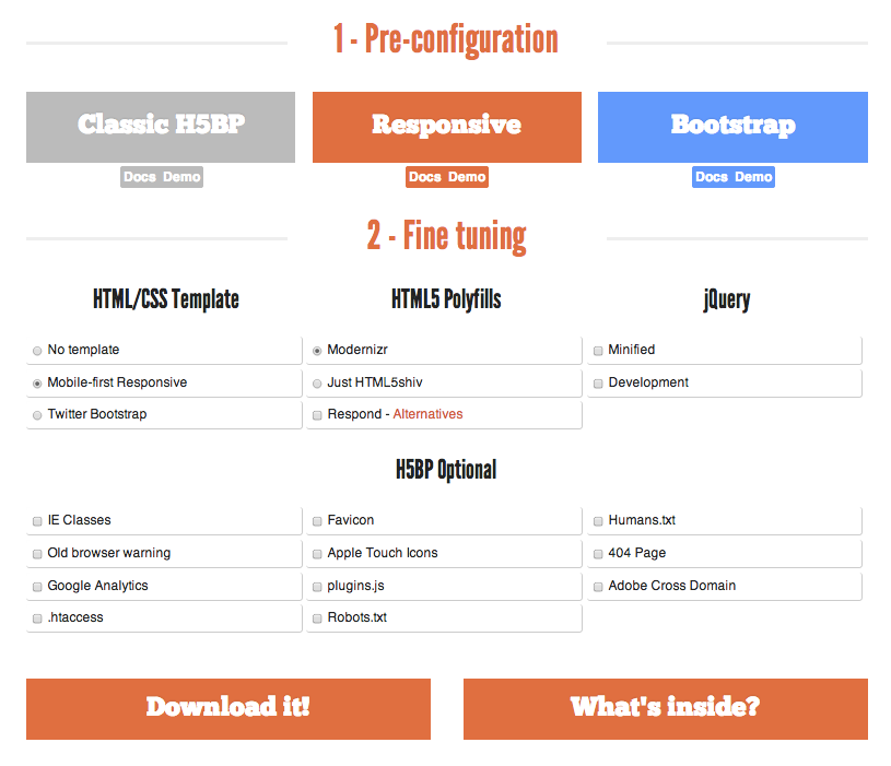
- Click the Responsive button, select Mobile-first Responsive and Modernizr, and deselect all of the other options (see Figure 1).
Note: The responsive project includes a default layout, CSS files, and other files that help illustrate the concepts of designing with CSS.

- Download the ZIP file and expand it to a folder on your computer.
- Launch Dreamweaver.
- Open index.html in Dreamweaver.
Note: Make sure you have the latest version of Dreamweaver. To do this, check the Apps tab of your Creative Cloud desktop application and verify that the status indicates Dreamweaver is up to date (see Figure 2).


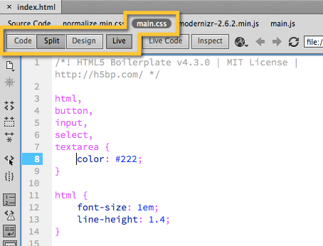
- Select Split View and enable Live View to preview the output and view the source code simultaneously.
Note: Throughout this tutorial, view the pages in Split View with Live View enabled and select main.css in the Document Toolbar (see Figure 3) so you can see how the settings in CSS Designer translate directly to valid CSS in Code View.

CSS fundamentals
In the early days of the web, HTML defined the page structure and styling was defined in attributes of the HTML tag. Web designers had to repeat styling rules within and across pages, making sites difficult to update and maintain.
CSS was created to help solve these issues by moving styling information to rules defined separately from the HTML. Designers and developers were then able organize and update styles in a single location and reuse them easily. Much of the actual layout was still done with HTML, while the CSS focused on defining size, color, or other basic visual attributes.
Today, CSS handles everything from the appearance of items to their placement on the page and even basic 2D and 3D animation. For the most part, HTML is used to indicate what an item is (for example, a paragraph, a heading, or a container, referred to as a DIV). Using just CSS, you can rearrange the look and feel of your page, regardless of the order in which elements appear in the HTML markup. You can even adjust styles or appearance based on factors such as the size or orientation of the screen.
Using CSS Designer in Dreamweaver
The CSS Designer tool in Dreamweaver provides a visual interface to add, modify, and remove styles in your page or in or external CSS files linked to it. Watch Style with CSS for a good demonstration of CSS Designer.
Note: You can define your styles directly in your page, known as internal style sheets, inside of a <style> block in your header, or on individual tags with inline styles. However, the recommended approach is to link to an external style sheet to get the benefits of reuse.
Follow these steps to customize the layout and position of CSS Designer and explore some of its basic functionality.
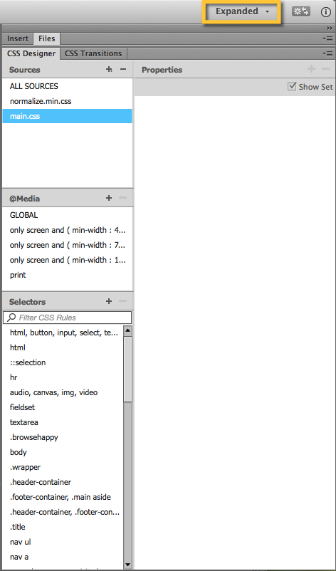
- To see the full CSS Designer panel, click the drop down in the upper-right corner and change the view from Compact to Expanded (see Figure 4).
Note: Collapse or close the File panel to increase the space available for CSS Designer.

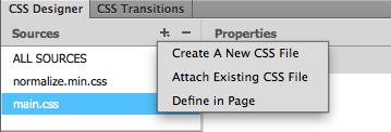
- CSS Designer enables you to easily create a new CSS file or link an existing one. Click the plus symbol in the Sources pane to see the options for associating a style sheet with a web page. Then, press the Escape button to hide the options.
The sample document includes two external CSS files: normalize.min.css and main.css (see Figure 5).

- Click main.css. The Selectors pane populates with the selectors defined in the style sheet.
Cascading in CSS
Cascading in CSS refers to the way web browsers select the style to apply to an element when the CSS has multiple properties defined for that element, or when styles are applied to the same element from multiple locations. Cascading – What Does it Mean? provides a good overview of how cascading works.
Specify default font properties
To illustrate one example of cascading, start by setting a default font, font size, and font color to the entire document. It is possible to create rules that apply to each HTML element that contains text; however that approach would be repetitive and error-prone. Cascading in CSS enables you to apply default text styles to the entire HTML page or body and let everything within the page inherit this style unless you override it.
- Click main.css in the Sources pane of CSS Designer.
- Click html, button, input, select, textarea in the Selectors list.
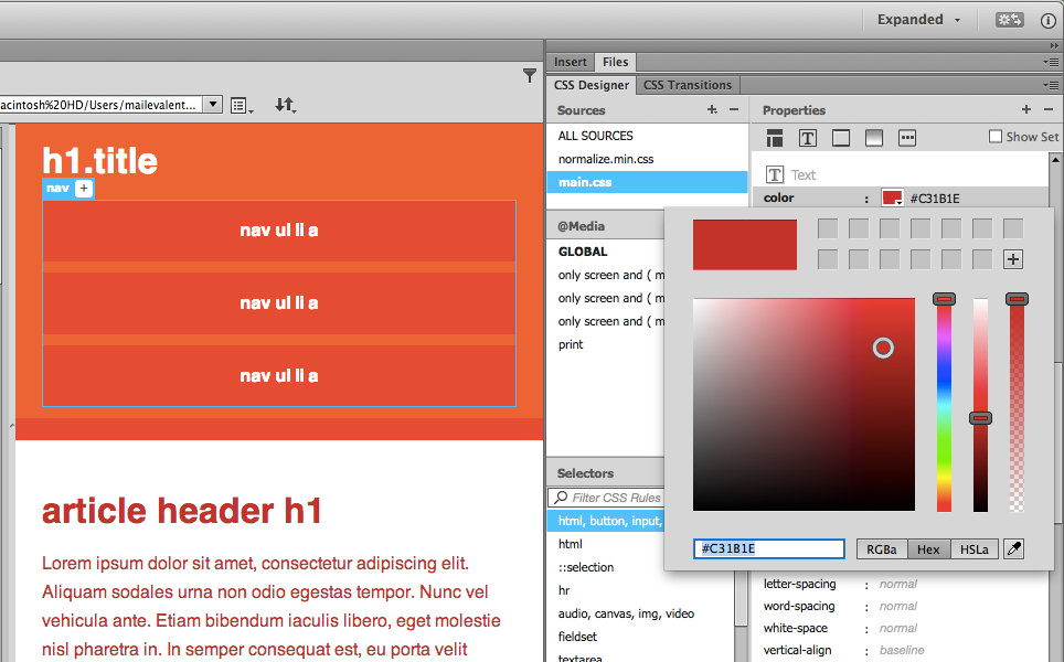
- Click the text icon (T) in the Properties pane. Note that the text color is set to #222, or close to black.
- Click the color picker and choose a new color to see how this works (see Figure 6).
The color property is defined on a high level element (html in this case), and it affects, or cascades to, most elements inside of it.
Notice that the paragraph and header elements change color as well because the color property cascades from the html element to the elements it contains. Also, notice that the white text in the header does not change because these elements define their own text color, thereby overriding the inherited color from the HTML tag.

- Set the color back to #222.
Specify CSS properties from multiple locations
Cascading also works when multiple rules are applied to the same element within or across CSS files. For instance, if you set paragraph elements in main.css to blue in the CSS code, you could define it like this:
p {color: blue;}
Then, set the font size in paragraphs to 10 pixels in normalize.min.css like this:
p {font-size:10px;}
Although the two rules are defined separately in different CSS files, they both apply and set paragraph text to blue and 10 pixels high.
CSS Specificity: Things You Should Know provides more in-depth information on the rules of cascading in CSS, including how conflicting CSS rules are handled.
Using selectors
As the name implies, CSS selectors enable you to select (or find) the HTML elements to which the styling of the CSS rule will be applied. Common selector types include element (or type), class, and id, among others.
Element (type) selector
Element, or type, selectors find all HTML elements of the specified type in the document. You can see how this selector works by using Dreamweaver to edit an existing element selector for the horizontal rule, or thematic break as it is defined in HTML5, tag.
- Add an <hr> tag to index.html. Select Split view and add <hr> beneath the header block at line 38. The existing style sheet has a rule that sets the hr element to a one-pixel, gray line.
- Select main.css from the Sources pane in CSS Designer and find hr among the selectors (use the search field to limit the results in the Selectors pane).
- Click hr and the Show Set checkbox to display only the style properties applied to it:
- height: 1px
- display: block
- margin: 1 em (top and bottom)
- border-top: #ccc;
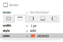
- Scroll to the Border section of the Properties pane and edit the top border by clicking the color selector. Use the eyedropper tool to select the light orange color in the header (see Figure 7).

Select main.css from the Document Toolbar and preview in Live View, with Split View enabled to see that the change sets the <hr> elements to orange (see Figure 8).
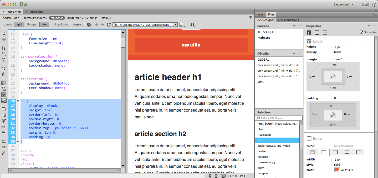

The CSS code, as shown in Code View, reflects the rule you modified in CSS Designer:
hr {
   display: block;
   height: 1px;
   border-left: 0;
   border-right: 0;
   border-bottom: 0;
   border-top: 1px solid #EC6433;
   margin: 1em 0;
   padding: 0;
}
Class selector
Class selectors can apply to any HTML element. To use one, define a class selector in a CSS file with a period at the beginning of the class name. Then, assign the class to an HTML element using the class attribute and the CSS class name without the period.
CSS class
.intro {
   color: #ccc;
   font-size: 10px;
}
HTML tag
<p class="intro">
Follow these steps to examine one of the class selectors in the sample project.
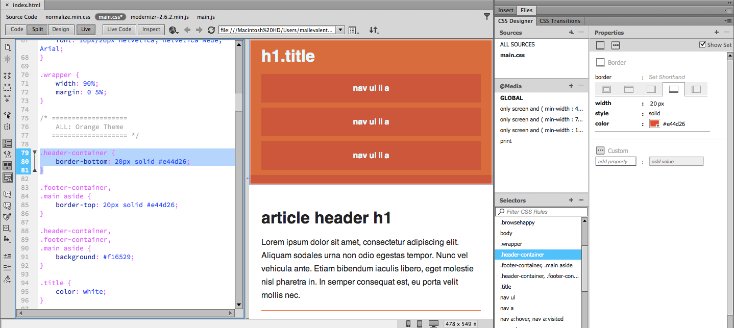
- Click the .header-container class in the Selectors pane of CSS Designer.
- Make sure Show Set is selected and review the three border-bottom properties defined for this class.
- width: 20px
- style: solid
- color: #e44d26
- Preview the effects of these changes to the bar between the nav items and the article header and review the corresponding CSS in Code View (see Figure 9). These properties apply a dark orange border along the bottom of the header.
.header-container {
    border-bottom: 20px solid #e44d26;
}

- Notice that header-container has a lighter orange background color that was not set in the previous CSS class.
- Find .header-container, .footer-container, .main aside in the Selectors pane. You can hover over the listing to show a tooltip if part of it is cut off from the view (see Figure 10).
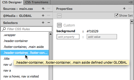

The following CSS reflects the selections made in CSS Designer.
.header-container,
.footer-container,
.main aside {
    background: #f16529;
}
In this example, multiple selectors are combined since they share a common property. The header-container, footer-container, and aside (this is called a descendant selector, discuss in more detail later) selectors all share the lighter orange background. Generally, combining elements that share the same property across multiple selectors results in more efficient and maintainable CSS.
ID selector
ID selectors find a single HTML element on the page and must be unique. To use one, define an ID selector in a CSS file with a hash tag at the beginning of the selector name. Then, assign the selector to an HTML element using the ID attribute and reference the CSS name without the hash tag; for example:
<div id="main"></div>
To style this element in CSS, you could use an ID selector that would look like this:
#main {
    background: #f16529;
}
Note: The sample project does not include any ID selectors.
In general, use an ID selector when you need to style just one element on a page and use a class selector to apply the same style to multiple elements. The Difference Between ID and Class explains this in more detail.
Descendant and child selectors
Descendant and child selectors are similar to each other with one important distinction. To understand the difference, first look at an example of a descendant selector from the example files.
- Search for nav a in the Selectors pane and make sure Show Set is selected.
- Compare the properties set in CSS Designer with its CSS defined in Code View (see Figure 11).
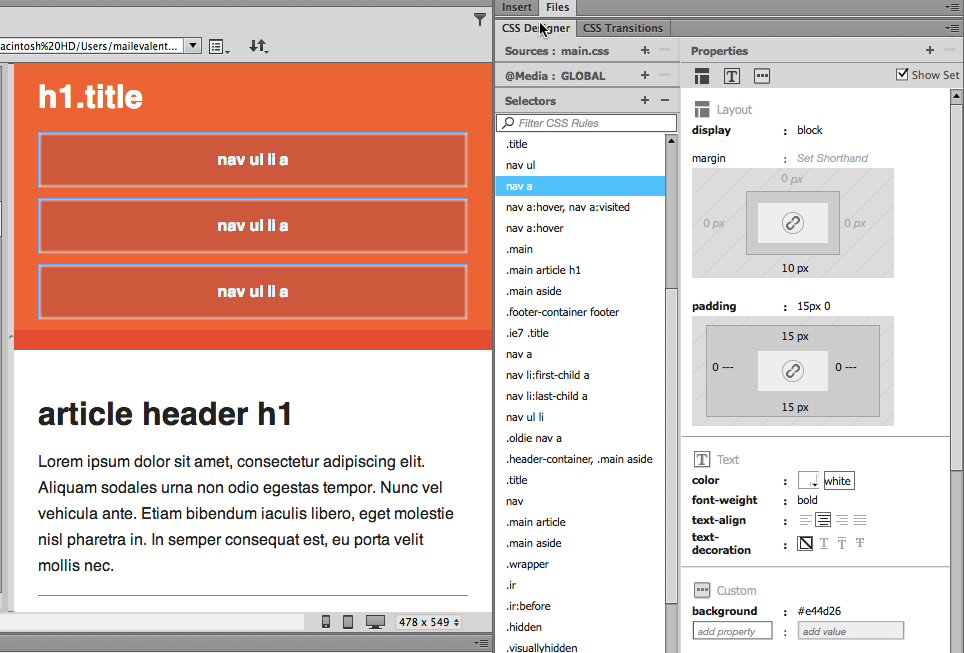

Code View shows the corresponding CSS:
nav a {
    display: block;
    margin-bottom: 10px;
    padding: 15px 0;

    text-align: center;
    text-decoration: none;
    font-weight: bold;

    color: white;
    background: #e44d26;
}
In this case, you are selecting any <a> element that is a descendant of a <nav> element. The Document Object Model (DOM) defines the structure of an HTML page as a tree of elements. In that tree, any HTML element contained within another HTML element is considered a descendant. Look at lines 20 through 26 of the sample HTML:
<nav>
    <ul>
        <li><a href="#">nav ul li a</a></li>
        <li><a href="#">nav ul li a</a></li>
        <li><a href="#">nav ul li a</a></li>
    </ul>
</nav>
In the above HTML, there are three HTML elements that are descendants of the <nav> element: <ul>, <li>, and <a>.
The descendent selector above will style any of the <a> elements that are beneath the <nav> element, regardless of how many levels down they are.
In contrast, a child selector will only select children, which are those elements one level below. The prior example written as a child selector rather than a descendant selector would look like this:
nav > a {
    ...
}
In the case of the HTML above, this child selector wouldn’t apply to any element, as there are no <a> elements that are one level below the <nav> element. However, here is an example that would work:
nav > ul {
    ...
}
Because the <ul> element is directly beneath the <nav> element and not contained within another tag, this child selector would apply to that element.
It is recommended to avoid using descendant or child selectors whenever possible as they have been shown to be the least efficient, or slowest, selector you can use. Overuse of poorly performing CSS can slow the rendering of your page in the browser. If you are curious about this topic, check out Google’s best practices guide.
* selector
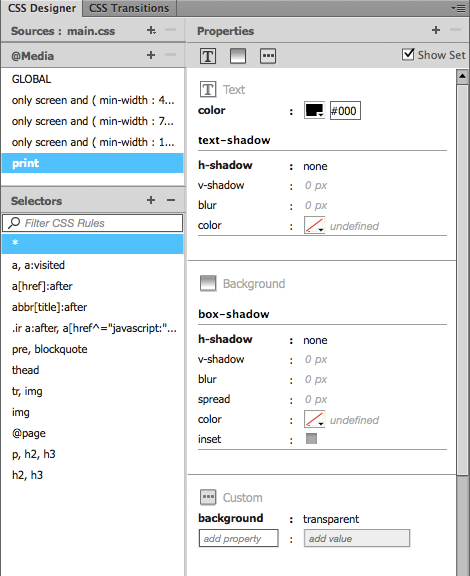
The asterisk is a universal selector and will match every element. For instance, if used by itself, it will match every element on the page. In the example page, there is one instance of the universal selector that applies to the print style sheet using a media query (see Figure 12).
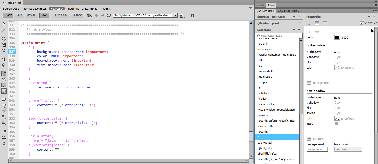

This CSS example eliminates the background colors and drop shadows on every element, and changes the text color of the appropriate elements to black for better printing.
* {
    background: transparent !important;
    color: #000 !important; /* Black prints faster: h5bp.com/s */
    box-shadow: none !important;
    text-shadow: none !important;
 }
Note: The !important declaration gives higher precedence to a CSS rule. For more information on this declaration, see When Using !important is the Right Choice.
You can combine the universal selector as a descendant selector. For instance, you could select every element within elements that have the CSS class "main" applied:
.main * {
    ...
}
Pseudo-classes and pseudo-elements
Pseudo-classes are special keywords that you can add to a selector to specify the state of an element. For example, the styling for a selector of a:hover is defined in an element selector (for the <a> tag) but will only be applied when a mouse hovers over the element (a link in this case).
Here is an example from the sample project that styles links (<a> tags) on the page, which is the most frequent use of pseudo-classes (see Figure 13).
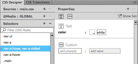

Check out Code View for the corresponding CSS.
nav a:hover,
nav a:visited {
    color: white;
}

nav a:hover {
    text-decoration: underline;
}
The first selector finds <a> tags within the <nav> in both the hover and visited states (visited being a link that the user has already clicked). It sets the text color to white to override any default link styling that may exist. The second selector finds <a> tags within the <nav>, also in the hover state, and sets them as underlined. Thus links have no underline by default, but are underlined when the mouse pointer hovers over them.
There are many more pseudo-classes than :hover and :visited. MDN has a thorough list. Some pseudo-classes enable you to select a specific element from a group of elements. Here’s an example from the sample page:
nav li:first-child a {
    margin-left: 0;
}

nav li:last-child a {
    margin-right: 0;
}
In this case, the pseudo-classes are specifying one specific element in a list of elements. The first selector finds the first <li> element that is a child of the <nav> element and applies a left margin to this element. The second selector applies a right margin to the last <li> that is a child of <nav>.
Additional selectors
This article covers many commonly used selectors, but not all selectors. For instance, it does not cover sibling selectors, complex selectors that use regular expressions, or the use of not(). See The 30 CSS Selectors You Must Memorize for a longer listing of selectors you can use.
Introducing media queries
Media queries enable you to define styles for a variety of output and device types such as mobile devices, tablets, and desktop computers. This section provides an introduction to media queries; read Introduction to Media Queries for a more in-depth explanation.
Media queries always start with @media. After that, there are two parts to a media query: the media type and the media features. In practice, however, you often see only one of them.
The first part is the media type. Though there are many different media types, the two most common are screen and print. The screen media type targets a computer screen and the print media type targets a printed page (that is, it optimizes the output when a user prints a web page).
Note: You can add media query information using the @Media pane of CSS Designer.
Follow these steps to select the print media query included in this project and review its properties in CSS Designer and in Code View.
- Select print from the @Media pane of CSS Designer.
- Click the universal selector (*) and view its properties (see Figure 14).

- Click the remaining selectors for the print media query to view their properties.
Below is an example of a media query using just the media type from the main.css file. This example uses the print media type.
@media print {
    * {
        background: transparent !important;
        color: #000 !important; /* Black prints faster: h5bp.com/s */
        box-shadow: none !important;
        text-shadow: none !important;
    }
}
Additional CSS rules are defined in the media query. In this case, the rule includes a universal selector that removes background colors and shadows from elements so it displays better when printed. There are a number of tricks you can use in your print stylesheets to display information that is hidden on the printed page, such as the URL for links as in the example CSS file within the print media query:
a[href]:after {
    content: " (" attr(href) ")";
}
The second part of a media query includes expressions, which contain one or more media features. If an expression evaluates to true, then that media query and the CSS rules it contains will be applied. Media features encompass a long list of properties but, in practice, you will most commonly see expressions based upon the screen size. In fact, these types of media queries form the basis of Responsive Web Design, an approach that uses CSS to modify the page layout to accommodate the various screen sizes of desktop computers, tablets, and phones among other devices.
The following is an expression from main.css.
@media only screen and (min-width: 1140px) {

/* ===============
    Maximal Width
   =============== */

    .wrapper {
        width: 1026px; /* 1140px - 10% for margins */
        margin: 0 auto;
    }
}
This media query contains two parts, the media type and the features. Expressed in normal language this media query applies to “only screens with width greater than 1140 pixels.” This means that the rule nested within the media query would not apply when printing, nor would it apply on smaller screens, such as those on mobile phones or tablets. The “only” keyword prevents older browsers that do not support media queries with media features (i.e., they only support media types screen and print) from applying the styles nested within the media query.
Using CSS for layout and positioning
This section provides an introduction to layout and positioning. Learn CSS Layout covers the basics of handling layout and positioning in CSS.
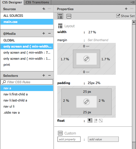
CSS Designer provides a visual interface to help define the layout and positioning aspects of CSS. For example the nav a rule in main.css illustrates the result of the margin and padding settings (see Figure 15).

For more on layout and positioning, watch Understanding the Box Model for a demonstration.
Where to go from here
Now that you have reviewed the basics of CSS and learned how to read and modify CSS from within Dreamweaver, you may want to check out other resources available on the web to explore these concepts further.
Mozilla Developer Network (MDN) is a great resource for overall web development and has a comprehensive section called Learn CSS. Check out CSS selectors by QuirksMode to learn how different browsers support the selector types. How to Use CSS Pseudo-Classes and Learning to Use the :before and :after Pseudo-Elements in CSS provide more details on using pseudo-classes.