用户指南 取消(C)

Add a dropdown component to an Adobe Captivate project

  1. Captivate User Guide
  2. Introduction to Captivate
    1. What's New in Adobe Captivate
    2. Adobe Captivate System Requirements
    3. Adobe Captivate Updates
      1. Adobe Captivate (12.5 update) release notes
      2. Adobe Captivate (12.4 update) release notes
      3. Adobe Captivate (12.3 update) release notes
      4. Adobe Captivate (12.2 update) release notes
      5. Adobe Captivate (12.1 update) release notes
    4. Download Adobe Captivate
    5. Frequently Asked Questions
  3. Add a slide
    1. Slide navigator in Adobe Captivate
    2. Add a conversation slide
    3. Add characters to your Adobe Captivate project
    4. Edit the background image on a slide
    5. Add padding to content blocks and components
    6. Create a long scroll project
  4. Design options in Adobe Captivate
    1. What are design options?
    2. Parts of a design option
    3. Create custom design options
    4. Modify a custom design option
    5. Export a custom design option
    6. Import a custom design option
  5. Add text blocks
    1. Add text to a project
    2. Add Adobe fonts to a project
  6. Add media blocks
    1. Add images to a project
    2. Add videos to a project
    3. Add quotes
    4. Add SVGs to a project
    5. Add web objects to a project
  7. Interactive components
    1. Add a button
    2. Add an input field
    3. Add a radio button group
    4. Add a dropdown
    5. Add a checkbox
  8. Add branding blocks
    1. Add a header to a project
    2. Add a footer to a project
  9. Widgets
    1. Add a Card
    2. Add Tabs
    3. Add a Certificate
    4. Add a Carousel
    5. Add a Hotspot
    6. Add Drag-and-Drop
    7. Add a Timeline
    8. Add Click to Reveal
    9. Add an Accordion
  10. Create quizzes
    1. Add a Multiple-choice question
    2. Add a True or false question
    3. Add a Match the column question
    4. Add a Short answer question
    5. Add a Sequence question
    6. Add question pools and random question slides
    7. Import questions as CSV
  11. Add audio to a project
    1. Add audio
    2. Add closed captions
  12. Interactions
    1. Add interactions to a project
    2. Create interactive video with overlay
    3. Create a slide-level interaction
    4. Create an object-level interaction
  13. Animations
    1. Add animations to a project
  14. Accessibility
    1. Make a project accessible
  15. Customize the timeline
    1. Timeline panel in Adobe Captivate
  16. Customize TOC and Playbar
    1. Table of Contents in Adobe Captivate
  17. Edit project properties
    1. Variables in Adobe Captivate
    2. Preferences
    3. Project dimensions
    4. Themes
  18. Create a simulation project
    1. Simulation
  19. Preview a project
    1. Preview
  20. Share a project for review
    1. Share for review
    2. FAQs and Troubleshooting guide for sharing projects for review   
  21. Publish a project
    1. Publish your project
  22. Upgrade projects in Adobe Captivate
    1. Upgrade projects to the latest version 

Overview

A dropdown list is a graphical user interface (GUI) element commonly used in software applications and websites. It presents a list of options that the user can select.
When the user clicks on or interacts with the dropdown box, a list of predefined choices "drops down" or expands, allowing the user to choose one of the available options.

A rectangular box with an arrow or downward-facing triangle on the right side represents the drop-down list. Depending on the design, when the user clicks or hovers over the box, the list of options appears below or above it. The options in the list are displayed in a vertical format, allowing the user to scroll if necessary.

Once the user selects an option from the dropdown list, it becomes the active or chosen value displayed within the box, replacing the default or previous selection. The selected option may trigger certain actions or provide input for further processing.

Adding a dropdown component

  1. On a slide, select Add interactive components > Dropdown.

  2. Select the dropdown component.

  3. Adjust the component size from the Alignment and Spacing section in the Visual Property panel. You can also set padding horizontally or vertically.

  4. Select a design option. A design option enables you to make your components exactly how you imagine by choosing responsive text or media blocks and editing the view, style, layout, color, object shapes, and much more.

  5. You can add a label to the dropdown, a button, or a card in the Components section.

Add options to the dropdown

  1. Select the dropdown component.

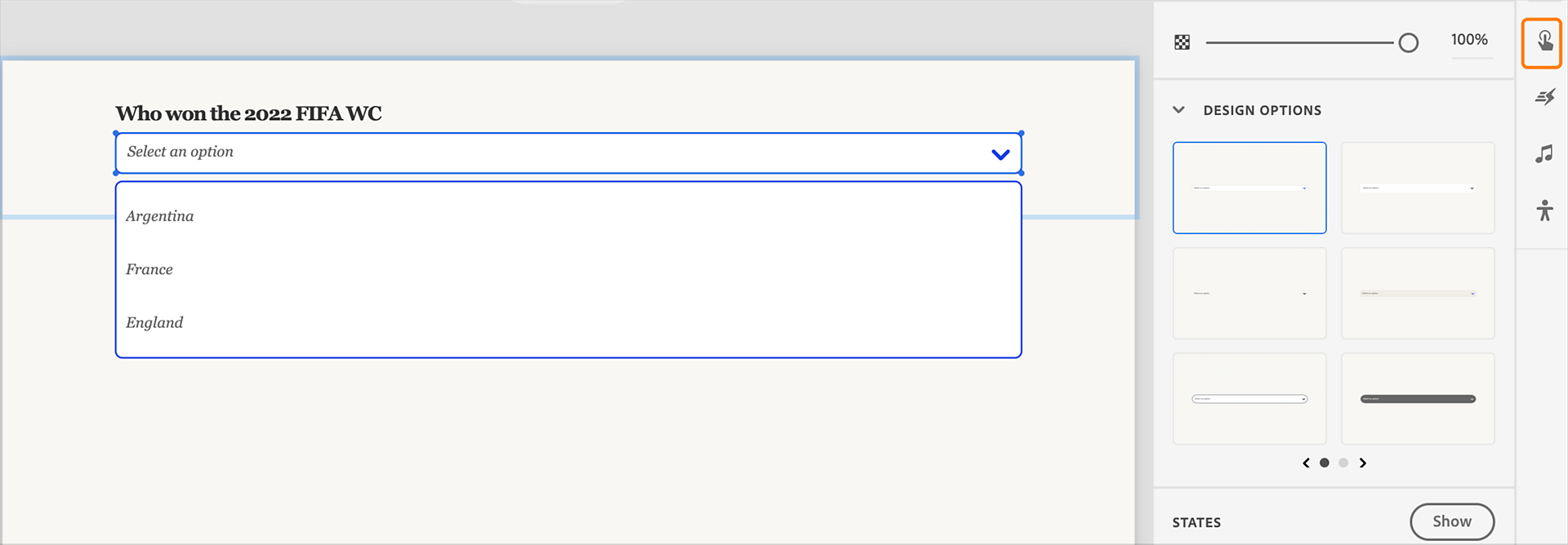
  2. In the Options section, select Edit Content. Edit the options in the dropdown.

    Add the answers in the dropdown
    Add the answers in the dropdown

  3. Double-click each option and add the choices.

    Display options in the dropdown
    Display options in the dropdown

  4. If you want to add more options to the list, in the Options section, move the slider to select more options.

  5. Change the shape of the dropdown component. You can change the background color, change the border, or add a shadow. You can also change the shape and color of the dropdown container by using the same color and shadow options.

    Change the shape of dropdown container
    Change the shape of dropdown container

  6. For each option, you can change the text properties, for example, font, size, color, and many more. You can also change the text properties of the list items.

Adding actions to a selection

  1. Select the dropdown component on the slide.

  2. Select Interactions on the right pane.

    Select Interactions
    Select Interactions

  3. Select the pill Selection of.

  4. Select the right option from the list.

    Select the right option
    Select the right option

  5. In the Action panel, select the required action that executes when you select the right option in the drop-down list.

更快、更轻松地获得帮助

新用户?