In addition to the standard HTML form elements, Dreamweaver supports custom controls to help you create flexible, professional-looking interfaces.
Editable select lists (also known as combo boxes) lets you combine the functionality of a select list with the functionality of a text box.
Extension UIs often contain pop-up menus that are defined using the select tag. In Dreamweaver, you can make pop-up menus in extensions editable by adding editable="true" to the select tag. To set a default value, set the editText attribute and the value that you want the select list to display.
The following example shows the settings for an editable select list:
 <select name="travelOptions" style="width:250px" editable="true" editText="other
    (please specify)">
<option value="plane">plane</option>
<option value="car">car</option>
<option value="bus">bus</option>
</select>
When you use select lists in your extensions, check for the presence and value of the editable attribute. If no value is present, the select list returns the default value of false, which indicates that the select list is not editable.
As with standard noneditable select lists, editable select lists have a selectedIndex property (see Objects, properties, and methods of the Dreamweaver DOM). This property returns -1 if the text box is selected.
To read the value of an active editable text box into an extension, read the value of the editText property. The editText property returns the string that the user entered into the editable text box or the value of the editText attribute. If no text has been entered and no value has been specified for editText, it returns an empty string.
Dreamweaver adds the following custom attributes for the select tag to control editable pop-up menus:
Attribute name |
Description |
Accepted values |
|---|---|---|
editable |
Declares that the pop-up menu has an editable text area |
A Boolean value of true or false |
editText |
Holds or sets text within the editable text area |
A string of any value |
Note
Editable select lists are available in Dreamweaver.
The following example creates a Command extension that contains an editable select list using common JavaScript functions:
-
 <html>
<head>
    <title>Editable Dropdown Test</title>
    <script language="javascript">
    function getAlert()
    {

        var i=document.myForm.mySelect.selectedIndex;
        if (i>=0)
        {
            alert("Selected index: " + i + "\n" + "Selected text " +
                    document.myForm.mySelect.options[i].text);
        }
        else
        {
            alert("Nothing is selected" + "\n" + "or you entered a value");
        }
    }
    function commandButtons()
    {
        return new Array("OK", "getAlert()", "Cancel", "window.close()");
    }
    </script>
</head>

<body>
<div name="test">
<form name="myForm">
<table>
    <tr>
        <td colspan="2">
        <h4>Select your favorite</h4>
        </td>
    </tr>
    <tr>
        <td>Sport:</td>
        <td>
        <select name="mySelect" editable="true" style="width:150px"
            editText="Editable Text">
            <option> Baseball</option>
            <option> Football </option>
            <option> Soccer </option>
        </select>
        </td>
    </tr>
</table>
</form>
</div>
</body>
</html>
Database controls facilitate the display of data hierarchies and fields.
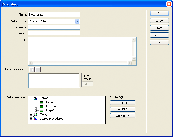
Using Dreamweaver, you can extend the HTML select tag to create a database tree control. You can also add a variable grid control. The database tree control displays database schema, and the variable grid control displays tabular information.
The following figure shows an advanced Recordset dialog box that uses a database tree control and a variable grid control:

Attribute name |
Description |
|---|---|
name |
Name of the database tree control |
control.style |
Width and height, in pixels |
type |
Type of control |
connection |
Name of the database connection that is defined in the Connection Manager; if empty, the control is empty. |
noexpandbuttons |
When this attribute is specified, the tree control does not draw the expand Plus (+) or collapse Minus (-) indicators or the associated arrows on the Macintosh. This attribute is useful for drawing multicolumn list controls. |
showheaders |
When this attribute is specified, the tree control displays a header at the top that lists the name of each column. |
Any option tags that are placed inside the select tag are ignored.
To add a database tree control to a dialog box, you can use the following sample code with appropriate substitutions for quoted variables:
 <select name="DBTree" style="width:400px;height:110px" ¬
type="mmdatabasetree" connection="connectionName" noexpandbuttons showHeaders></select>
You can change the connection attribute to retrieve selected data and display it in the tree. You can use the DBTreeControl attribute as a JavaScript wrapper object for the new tag. For more examples, see the DBTreeControlClass.js file in the Configuration/Shared/Common/Scripts folder.
Attribute name |
Description |
|---|---|
name |
Name of the variable grid control |
style |
Width of the control, in pixels |
type |
Type of control |
columns |
Each column must have a name, separated by a comma |
columnWidth |
Width of each column, each separated by a comma. The columns are of equal width if you do not specify widths. |
 <select name="ParamList" style="width:515px;" ¬
type="mmparameterlist columns"="Name,SQL Data ¬
Type,Direction,Default Value,Run-time Value" size=6></select>
The following example creates a variable grid control that is 500 pixels wide, with five columns of various widths:
 <select
    name="ParamList"
    style="width:500px;"
    type="mmparameterlist"
    columns="Name,SQL Data Type,Direction, Default Value,Run-time Value"
    columnWidth="100,25,11,"
    size=6>
This example creates two blank columns that are 182 pixels wide. (The specified columns total 136. The total width of the variable grid control is 500. The remaining space after the first three columns are placed is 364. Two columns remain; 364 divided by 2 is 182.)
This variable grid control also has a JavaScript wrapper object that should be used to access and manipulate the variable grid control’s data. You can find the implementation in the GridControlClass.js file in the Configuration/Shared/MM/Scripts/Class folder.
Tree controls organize information into expandable and collapsible nodes.
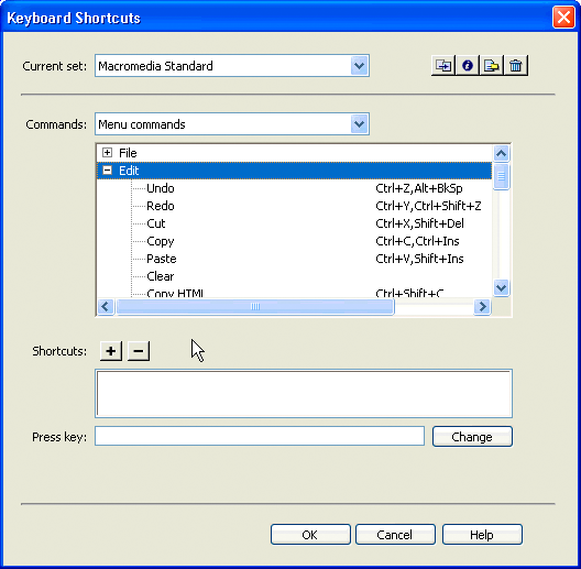
Tree controls display data in a hierarchical format and let users expand and collapse nodes in the tree. The MM:TREECONTROL tag lets you create tree controls for any type of information. Unlike the database tree control that is described in Adding a database tree control, no association with a database is required. The Dreamweaver Keyboard Shortcuts editor uses the tree control, as shown in the following figure:

The MM:TREECONTROL tag creates a tree control and can use one or more tags to add structure, as described in the following list:
MM:TREECOLUMN is an empty, optional tag that defines a column in the tree control.
MM:TREENODE is an optional tag that defines a node in the tree. It is a nonempty tag that can contain only other MM:TREENODE tags.
Attribute name |
Description |
|---|---|
name |
Name of the tree control |
size |
Optional. Number of rows that show in the control; default is 5 rows |
theControl |
Optional. If the number of nodes in the theControl attribute exceeds the value of the size attribute, scrollbars appear |
multiple |
Optional. Allows multiple selections; default is single-selection |
style |
Optional. Style definition for height and width of tree control; if specified, takes precedence over the size attribute |
noheaders |
Optional. Specifies that the column headers should not appear |
Attribute name |
Description |
|---|---|
name |
Name of the column |
value |
String to appear in column header |
width |
Width of the column in pixels (percentage not supported); default is 100 |
align |
Optional. Specifies whether the text in the column should be aligned left, right, or center; default is left |
state |
Specifies whether the column is visible or hidden |
For readability, TREECOLUMN tags should follow immediately after the MM:TREECONTROL tag, as shown in the following example:
 <MM:TREECONTROL name="tree1">
<MM:TREECOLUMN name="Column1" width="100" state="visible">
<MM:TREECOLUMN name="Column2" width="80" state="visible">
...
</MM:TREECONTROL>
Attribute name |
Description |
|---|---|
name |
Name of the node |
value |
Contains the content for the given node. For more than one column, this is a pipe-delimited string. To specify an empty column, place a single space character before the pipe (|). |
state |
Specifies that the node is expanded or collapsed with the strings "expanded" or "collapsed". |
selected |
You can select multiple nodes by setting this attribute on more than one tree node, if the tree has a MULTIPLE attribute. |
icon |
Optional. The index of built-in icon to use, starting with 0: 0 = no icon; 1 = Dreamweaver document icon; 2 = multidocument icon |
 <mm:treecontrol name="test" style="height:300px;width:300px">

<mm:treenode value="rootnode1" state="expanded">
<mm:treenode value="node1" state="expanded"></mm:treenode>
<mm:treenode value="node3" state="expanded"></mm:treenode>
</mm:treenode>

<mm:treenode value="rootnode2"0state="expanded">
<mm:treenode value="node2" state="expanded"></mm:treenode>
<mm:treenode value="node4" state="expanded"></mm:treenode>
</mm:treenode>

</mm:treecontrol>
Tree controls and the nodes within them are implemented as HTML tags. They are parsed by Dreamweaver and stored in the document tree. These tags can be manipulated in the same way as any other document node. For more information on DOM functions and methods, see The Dreamweaver Document Object Model.
Add a node
To add a node to an existing tree control programmatically, set the innerHTML property of the MM:TREECONTROL tag or one of the existing MM:TREENODE tags. Setting the inner HTML property of a tree node creates a nested node.
The following example adds a node to the top level of a tree:
var tree = document.myTreeControl; //add a top-level node to the bottom of the tree tree.innerHTML = tree.innerHTML + ‘<mm:treenode name="node3" value="node3">’;Add a child node
To add a child node to the currently selected node, set the innerHTML property of the selected node.
The following example adds a child node to the currently selected node:
var tree = document.myTreeControl; var selNode = tree.selectedNodes[0]; //deselect the node, so we can select the new one selnode.removeAttribute("selected"); //add the new node to the top of the selected node’s children selNode.innerHTML = '<mm:treenode name="item10" value="New item11" expanded selected>' + ¬ selNode.innerHTML;Delete a node
To delete the currently selected node from the document structure, use the innerHTML or outerHTML properties.
The following example deletes the entire selected node and any children:
var tree = document.myTreeControl; var selNode = tree.selectedNodes[0]; selNode.outerHTML = "";Color button controls let you add color picker interfaces to your extensions.
In addition to the standard input types such as text, check box, and button, Dreamweaver supports mmcolorbutton, an additional input type in extensions.
Specifying <input type="mmcolorbutton"> in your code causes a color picker to appear in the user interface. You can set the default color for the color picker by setting a value attribute on the input tag. If you do not set a value, the color picker appears gray by default and the value property of the input object returns an empty string.
The following example shows a valid mmcolorbutton tag:
 <input type="mmcolorbutton" name="colorbutton" value="#FF0000">
<input type="mmcolorbutton" name="colorbutton" value="teal">
A color button has one event, onChange, which is triggered when the color changes.
Keep a text box and the color picker synchronized. The following example creates a text box that synchronizes the color of the text box with the color of the color picker:
 <input type = "mmcolorbutton" name="fgcolorPicker" onChange="document.fgcolorText.value=this.value">
<input type = "test" name="fgcolorText" onBlur="document.fgColorPicker.value=this.value">
In this example, the user changes the value of the text box and then tabs or clicks elsewhere. Then, the color picker updates to show the color that is specified in the text box. Whenever the user selects a new color with the color picker, the text box updates to show the hexadecimal value for that color.
