
Choose Edit > Preferences > Type (Windows) or Photoshop > Preferences > Type (Mac OS).
Ultima actualizare la
15 nov. 2022
- Photoshop User Guide
- Introduction to Photoshop
- Photoshop and other Adobe products and services
- Photoshop on mobile (not available in mainland China)
- Photoshop on the iPad (not available in mainland China)
- Photoshop on the iPad | Common questions
- Get to know the workspace
- System requirements | Photoshop on the iPad
- Create, open, and export documents
- Add photos
- Work with layers
- Draw and paint with brushes
- Make selections and add masks
- Retouch your composites
- Work with adjustment layers
- Adjust the tonality of your composite with Curves
- Apply transform operations
- Crop and rotate your composites
- Rotate, pan, zoom, and reset the canvas
- Work with Type layers
- Work with Photoshop and Lightroom
- Get missing fonts in Photoshop on the iPad
- Japanese Text in Photoshop on the iPad
- Manage app settings
- Touch shortcuts and gestures
- Keyboard shortcuts
- Edit your image size
- Livestream as you create in Photoshop on the iPad
- Correct imperfections with the Healing Brush
- Create brushes in Capture and use them in Photoshop on the iPad
- Work with Camera Raw files
- Create and work with Smart Objects
- Adjust exposure in your images with Dodge and Burn
- Auto adjustment commands in Photoshop on the iPad
- Smudge areas in your images with Photoshop on the iPad
- Saturate or desaturate your images using Sponge tool
- Content aware fill for iPad
- Photoshop on the web (not available in mainland China)
- Photoshop (beta) (not available in mainland China)
- Generative AI (not available in mainland China)
- Common questions on generative AI in Photoshop
- Generative Fill in Photoshop on the desktop
- Generate Image with descriptive text prompts
- Generative Expand in Photoshop on the desktop
- Replace background with Generate background
- Get new variations with Generate Similar
- Select an AI model for generative control
- Generative Fill in Photoshop on the iPad
- Generative Expand in Photoshop on the iPad
- Generative AI features in Photoshop on the web
- Content authenticity (not available in mainland China)
- Cloud documents (not available in mainland China)
- Photoshop cloud documents | Common questions
- Photoshop cloud documents | Workflow questions
- Manage and work with cloud documents in Photoshop
- Upgrade cloud storage for Photoshop
- Unable to create or save a cloud document
- Solve Photoshop cloud document errors
- Collect cloud document sync logs
- Invite others to edit your cloud documents
- Share documents for review
- Workspace
- Workspace basics
- Preferences
- Learn faster with the Photoshop Discover Panel
- Create documents
- Place files
- Default keyboard shortcuts
- Customize keyboard shortcuts
- Tool galleries
- Performance preferences
- Contextual Task Bar
- Use tools
- Presets
- Grid and guides
- Touch gestures
- Use the Touch Bar with Photoshop
- Touch capabilities and customizable workspaces
- Technology previews
- Metadata and notes
- Place Photoshop images in other applications
- Rulers
- Show or hide non-printing Extras
- Specify columns for an image
- Undo and history
- Panels and menus
- Position elements with snapping
- Position with the Ruler tool
- Organize, share, and collaborate with Projects
- Refine Adobe Firefly generations
- Image and color basics
- How to resize images
- Work with raster and vector images
- Image size and resolution
- Acquire images from cameras and scanners
- Create, open, and import images
- View images
- Invalid JPEG Marker error | Opening images
- Viewing multiple images
- Customize color pickers and swatches
- High dynamic range images
- Match colors in your image
- Convert between color modes
- Color modes
- Erase parts of an image
- Blending modes
- Choose colors
- Customize indexed color tables
- Image information
- Distort filters are unavailable
- About color
- Color and monochrome adjustments using channels
- Choose colors in the Color and Swatches panels
- Sample
- Color mode or Image mode
- Color cast
- Add a conditional mode change to an action
- Add swatches from HTML CSS and SVG
- Bit depth and preferences
- Layers
- Layer basics
- Nondestructive editing
- Create and manage layers and groups
- Select, group, and link layers
- Place images into frames
- Layer opacity and blending
- Mask layers
- Apply Smart Filters
- Layer comps
- Move, stack, and lock layers
- Mask layers with vector masks
- Manage layers and groups
- Layer effects and styles
- Edit layer masks
- Extract assets
- Reveal layers with clipping masks
- Generate image assets from layers
- Work with Smart Objects
- Blending modes
- Combine multiple images into a group portrait
- Combine images with Auto-Blend Layers
- Align and distribute layers
- Copy CSS from layers
- Load selections from a layer or layer mask's boundaries
- Knockout to reveal content from other layers
- Selections
- Get started with selections
- Make selections in your composite
- Select and Mask workspace
- Select with the marquee tools
- Select with the lasso tools
- Adjust pixel selections
- Move, copy, and delete selected pixels
- Create a temporary quick mask
- Select a color range in an image
- Convert between paths and selection borders
- Channel basics
- Save selections and alpha channel masks
- Select the image areas in focus
- Duplicate, split, and merge channels
- Channel calculations
- Get started with selections
- Image adjustments
- Replace object colors
- Perspective warp
- Reduce camera shake blurring
- Healing brush examples
- Export color lookup tables
- Adjust image sharpness and blur
- Understand color adjustments
- Apply a Brightness/Contrast adjustment
- Adjust shadow and highlight detail
- Levels adjustment
- Adjust hue and saturation
- Adjust vibrance
- Adjust color saturation in image areas
- Make quick tonal adjustments
- Apply special color effects to images
- Enhance your image with color balance adjustments
- High dynamic range images
- View histograms and pixel values
- Match colors in your image
- Crop and straighten photos
- Convert a color image to black and white
- Adjustment and fill layers
- Curves adjustment
- Blending modes
- Target images for press
- Adjust color and tone with Levels and Curves eyedroppers
- Adjust HDR exposure and toning
- Dodge or burn image areas
- Make selective color adjustments
- Image repair and restoration
- Image enhancement and transformation
- Drawing and painting
- Paint symmetrical patterns
- Draw rectangles and modify stroke options
- About drawing
- Draw and edit shapes
- Create star or any other pointed shape
- Painting tools
- Create and modify brushes
- Blending modes
- Add color to paths
- Edit paths
- Paint with the Mixer Brush
- Brush presets
- Gradients
- Gradient interpolation
- Fill and stroke selections, layers, and paths
- Draw with the Pen tools
- Create patterns
- Generate a pattern using the Pattern Maker
- Manage paths
- Manage pattern libraries and presets
- Draw or paint with a graphics tablet
- Create textured brushes
- Add dynamic elements to brushes
- Gradient
- Paint stylized strokes with the Art History Brush
- Paint with a pattern
- Sync presets on multiple devices
- Migrate presets, actions, and settings
- Text
- Filters and effects
- Saving and exporting
- Color Management
- Web, screen, and app design
- Video and animation
- Printing
- Automation
- Troubleshooting
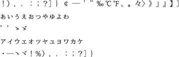
Photoshop provides several options for working with Chinese, Japanese, and Korean type.
Notă
Your operating system must support the languages and fonts in which you wish to work. Consult your system software manufacturer for more information.
Display and set Asian type options
Photoshop 23.0 (October 2021) release now includes seamless unified typographical support for Japanese, Chinese, and Korean without having to select the East Asian text engine in Preferences or the Paragraph panel flyout menu.
Additionally, all East Asian advanced typographic features will be automatically available and grouped together in the Photoshop Type Layer Properties panel. They are still available in the Character and Paragraph panels by selecting "East Asian Features" in the Paragraph panel flyout menu.
You can also control how font names are displayed—in English or in the native language.
-
-
Select from the following options:
Show Font Names in English
Displays Asian font names in English.
East Asian (Photoshop and Photoshop CS6) or Show Asian Text Options (CS5)
Displays Asian type options in the Character and Paragraph panels.

Character, Paragraph, and Type Layer Properties panel
Character, Paragraph, and Type Layer Properties panel

Reduce spacing around Asian type characters using tsume
Tsume reduces the space around a character by a specified percentage value. As a result, the character itself is not stretched or squeezed. Instead, the space between the character’s bounding box and the em box is compressed. When tsume is added to a character, spacing around both sides of the character are reduced by an equal percentage.
-
Select the characters you want to adjust.
-
In the Character panel, enter or select a percentage for Tsume
 . The
greater the percentage, the tighter the compression between characters.
At 100% (the maximum value), there is no space between the character’s
bounding box and its em box.
. The
greater the percentage, the tighter the compression between characters.
At 100% (the maximum value), there is no space between the character’s
bounding box and its em box.
With the Photoshop 23.0 (October 2021) release, Tsume can also be accessed from the Type Layer Properties panel.
Specify how leading is measured in Asian type
-
Select the paragraphs you want to adjust.
-
Choose a leading option from the Paragraph panel menu.
Top-to-top Leading
Measures the spacing between lines of type from the top of one line to the top of the next line. When you use top‑to‑top leading, the first line of type in a paragraph is aligned flush with the top of the bounding box.
Bottom-to-bottom Leading
For horizontal type, measures the space between lines of type from the type baseline. When you use bottom-to-bottom leading, space appears between the first line of type and the bounding box. A check mark indicates which option is selected.
NotăThe leading option you choose does not affect the amount of leading between lines, only how the leading is measured.
Use tate‑chu‑yoko
Tate‑chu‑yoko is a block of horizontal type laid out within vertical type lines. Using tate‑chu‑yoko makes it easier to read half-width characters such as numbers, dates, and short foreign words in vertical text.

-
Select the characters you want to rotate.
-
Choose Tate‑Chu‑Yoko from the Character panel menu. A checkmark indicates that the option is turned on.
With the Photoshop 23.0 (October 2021) release, you can also choose the icon from the Type Layer Properties panel. In this case, the highlighted icon indicates the option is turned on.
NotăUsing tate‑chu‑yoko does not prevent you from editing and formatting type; you can edit and apply formatting options to rotated characters just as you do to other characters.
Align Asian characters with mojisoroe
Mojisoroe is the alignment of characters in Asian type. When a line of text contains different sizes of characters, you can specify how to align text to the largest characters in the line: to the top, center, or bottom of the em box (right, center, and left for vertical frames), to the roman baseline, or to the top or bottom of the ICF box (right or left for vertical frames). ICF (Ideographic Character Space) is the average height and width used by the font designer to design the ideographic characters that comprise a font.

A. Small characters aligned to the bottom B. Small characters aligned to the center C. Small characters aligned to the top
-
In the Character panel menu, choose an option from the Character Alignment submenu:
Roman Baseline
Aligns the small characters in a line to the large character.
Em box Top/Right, Em box Center, or Em box Bottom/Left
Aligns the small characters in a line to the specified position of the large character’s em box. In vertical text frames, Em box Top/Right aligns the text to the right of the em box, and Em box Bottom/Left aligns the text to the left of the em box.
ICF Top/Right and ICF Bottom/Left
Aligns the small characters in a line to the ICF specified by the large characters. In vertical text frames, ICF Top/Right aligns the text to the right of the ICF, and ICF Bottom/Left aligns the text to the left of the ICF.
NotăWith the Photoshop 23.0 (October 2021) release, you can also choose an option from the Type Layer Properties panel.
Specify left and right underlining with Asian type
-
Select vertical type.
-
Choose either Underline Left or Underline Right from the Character panel flyout menu.
Set Asian OpenType font options
Asian OpenType fonts may include a number of features that aren’t available in PostScript and TrueType fonts. It is usually best to use any weights of Kozuka Gothic Pr6N and Kozuka Mincho Pr6N OpenType fonts. These fonts have the largest collection of glyphs of the Asian fonts produced by Adobe.
-
With the Type tool selected, do one of the following:
On an existing type layer, select the characters or type objects to which you want to apply the setting.
Click the image to create a new type layer.
-
In the Character panel, make sure that an Asian OpenType Pro font is selected.
-
From the Character panel flyout menu, choose an OpenType option.
Japanese 78 Substitutes the standard glyph with the jp78‑variant glyph.
Japanese Expert Substitutes the standard glyph with the expert-variant glyphs.
Japanese Traditional Substitutes the standard glyph with the traditional-variant glyph.
Proportional Metrics Substitutes the half-width and the full-width glyphs with the proportional glyph.
Kana Substitutes the standard kana glyph with the horizontally optimized kana glyph for horizontal layout. However, the differences are often very subtle.
Roman Italics Substitutes the standard proportional glyph with the italic glyph.
For more information, see Apply OpenType features.
On-canvas glyph alternatives and Glyphs panel
When you're working in a Type layer, you can select a glyph to quickly view alternatives to it right on the canvas. Clicking the > icon in the alternatives grid takes you to the Glyphs panel.


Choose a mojikumi set
Mojikumi specifies Japanese text composition for spacing of Japanese characters, roman characters, punctuation, special characters, line start, line end, and numbers. Photoshop includes several predefined mojikumi sets based on the Japanese Industrial Standard (JIS) X 4051‑1995.
-
In the Paragraph panel, choose an option from the Mojikumi pop‑up menu.
With the Photoshop 23.0 (October 2021) release, Mojikumi pop-up menu can also be accessed from the Type Layer Properties panel
None
Turns off the use of mojikumi.
Mojikumi Set 1
Uses half‑width spacing for punctuation.
Mojikumi Set 2
Uses full‑width spacing for most characters except the last character in the line.

Mojikumi Set 1, and Mojikumi Set 2
Mojikumi Set 1, and Mojikumi Set 2 Mojikumi Set 3
Uses full‑width spacing for most characters and the last character in the line.
Mojikumi Set 4
Uses full‑width spacing for all characters.
Mojikumi Set 3, and Mojikumi Set 4
Mojikumi Set 3, and Mojikumi Set 4


Set kinsoku shori options
Kinsoku shori specifies line breaks for Japanese text. Characters that cannot begin a line or end a line are known as kinsoku characters. Photoshop includes weak and maximum kinsoku sets based on the Japanese Industrial Standard (JIS) X 4051‑1995. Weak kinsoku sets omit long vowel symbols and small hiragana characters.
Disable or enable kinsoku shori for a paragraph
-
In the Paragraph panel, choose an option from the Kinsoku pop‑up menu.
With the Photoshop 23.0 (October 2021) release, the Kinsoku pop-up menu can also be accessed from the Type Layer Properties panel.
None
Turns off the use of kinsoku shori.
JIS Weak or JIS Maximum
Prevents the following characters from beginning or ending a line:
JIS Weak Set
Characters that can’t begin a line

Characters that can’t end a line

JIS Maximum Set
Characters that can’t begin a line
Characters that can’t end a line

Specify a kinsoku line-breaking option
Kinsoku shori or mojikumi must be selected to use the following line-breaking options.
-
From the Paragraph panel flyout menu, choose Kinsoku Shori Type and then choose one of the following methods:
Push In First
Moves characters up to the previous line to prevent prohibited characters from ending or beginning a line.
Push Out First
Moves characters down to the next line to prevent prohibited characters from ending or beginning a line.
Push Out Only
Always moves characters down to the next line to prevent prohibited characters from ending or beginning a line. A push-in is not attempted.
A check mark indicates which method is selected.
Specify a burasagari option
Burasagari lets single‑byte periods, double‑byte periods, single‑byte commas, and double‑byte commas fall outside the paragraph bounding box.
-
In the Paragraph panel, choose Burasagari from the panel menu.
With the Photoshop 23.0 (October 2021) release, the Burasagari option can also be set using a pop-up menu in the Type Layer Properties panel.
-
Choose an option from the submenu:
None
Turns off hanging punctuation.
Regular
Turns on hanging punctuation without forcing ragged lines to the bounding box edge.
Force
Forces punctuation outside the bounding box by spreading lines that end within the bounding box and end with one of the hanging characters.
NotăThe Burasagari options are not available when Kinsoku Shori is set to None.
Other Asian OpenType features
Other Asian OpenType features that the font supports are included in the pop-up menu available below the font menu in the Glyphs panel. Note that additional OpenType options are available depending on the font.

For more information, see Glyphs panel.