Set your message.
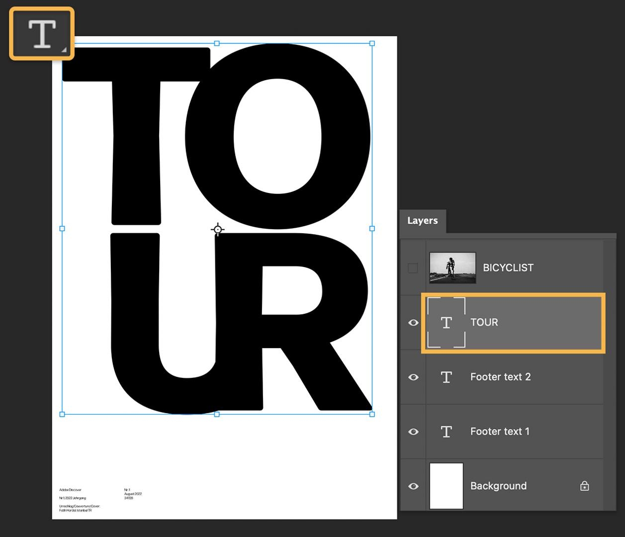
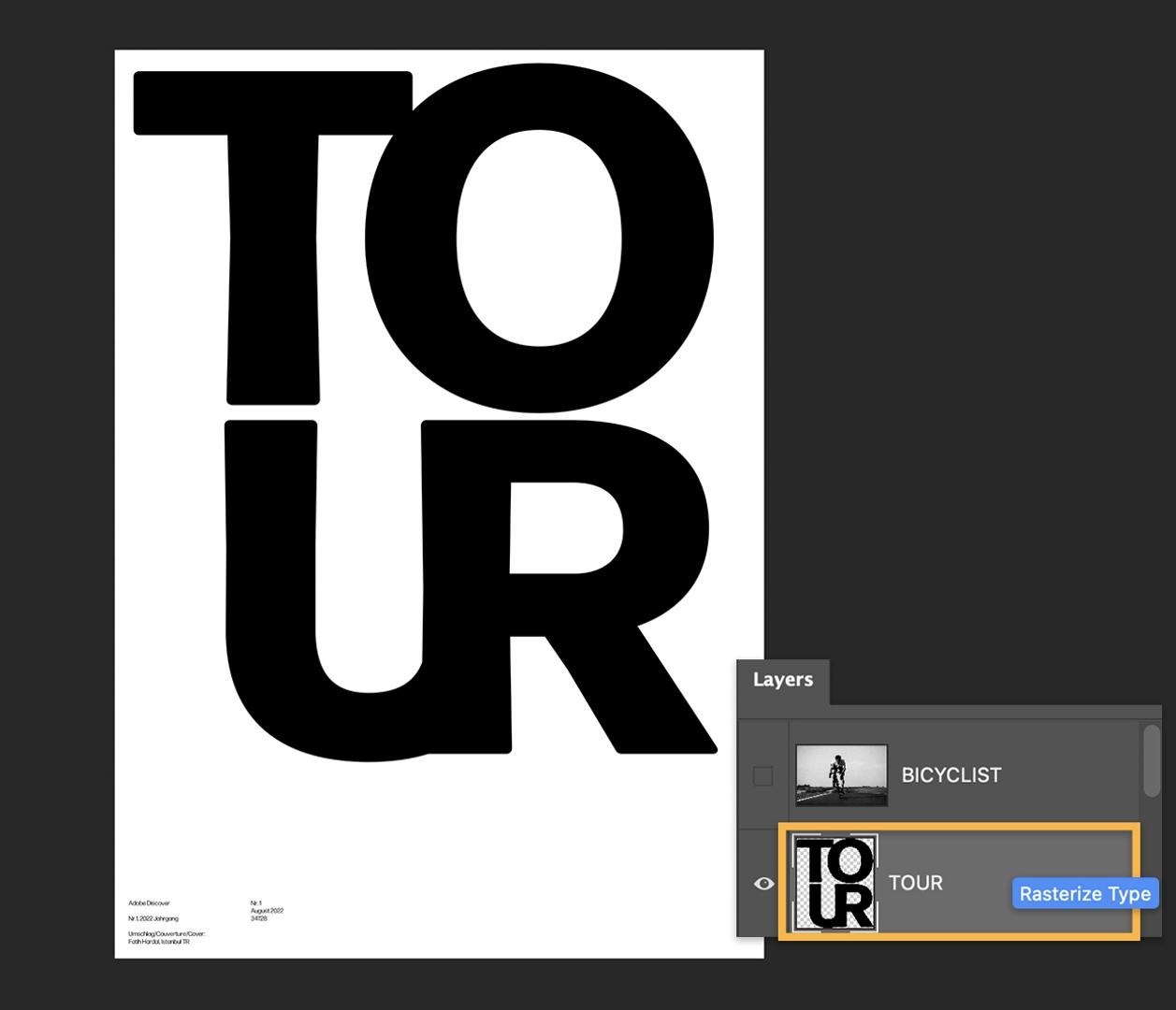
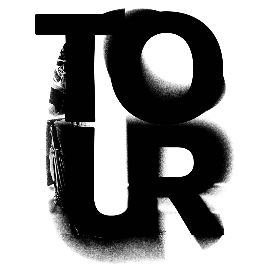
Open up Fatih’s practice file, which includes live text that you can edit and customize, if desired, in the Layer titled “TOUR.”
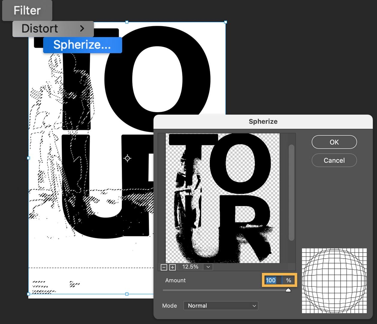
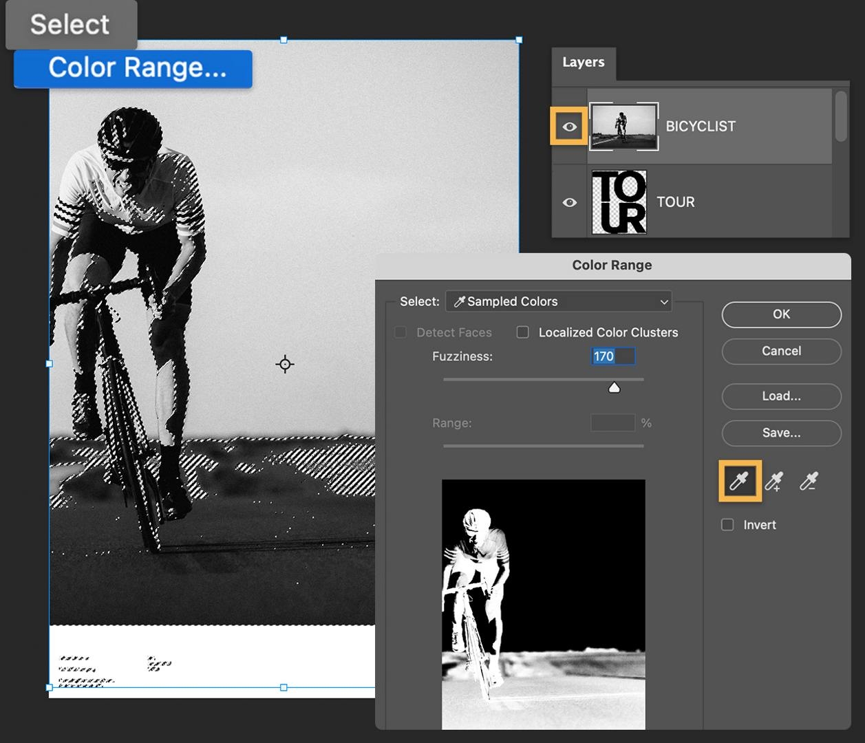
For this technique, Fatih suggests using a bold sans-serif font to create a short, four-letter word, stacked tightly to fill most of the poster area. This way, the letters will form a good amount of positive space, he explains, for us to distort with texture while keeping it legible. Here, he uses Forma DJR from Adobe Fonts.