Documentation for Substance Designer 3D is now available on Experience League. After March 14th, HelpX pages will automatically redirect to the equivalent Experience League page.
Refer to the FAQ for more information about which documentation is affected.
- Substance 3D home
- User guide
- Glossary
- Getting started
- Workspace
- Workspace
- Customizing your workspace
- Home screen
- Main toolbar
- Preferences
- Explorer
- Graph view
- Library
- Properties
- 2D view
- 3D view
- Dependency manager
- Resources
- Resources
- Importing, linking and new resources
- Bitmap resource
- Vector graphics (SVG) resource
- 3D scene resource
- AxF (Appearance eXchange Format)
- Font resource
- Warnings from dependencies
- Substance graphs
- Substance graphs
- Substance graph key concepts
- Creating a Substance graph
- Instances and subgraphs
- Graph parameters
- Manage parameters
- 'Visible if' expressions
- Inheritance in Substance graphs
- Output size
- Values in Substance graphs
- Publishing Substance 3D asset files (SBSAR)
- Exporting bitmaps
- Exporting PSD files
- Sample Substance graphs
- Warnings in Substance graphs
- Nodes reference for Substance graphs
- Nodes reference for Substance graphs
- Atomic nodes
- Node library
- Node library
- Texture generators
- Texture generators
- Noises
- Noises
- 3D Perlin noise
- 3D Perlin noise fractal
- 3D Ridged noise fractal
- 3D Simplex noise
- 3D Voronoi
- 3D Voronoi fractal
- 3D Worley noise
- Anisotropic noise
- Blue noise fast
- BnW spots 1
- BnW spots 2
- BnW spots 3
- Cells 1
- Cells 2
- Cells 3
- Cells 4
- Clouds 1
- Clouds 2
- Clouds 3
- Creased
- Crystal 1
- Crystal 2
- Directional noise 1
- Directional noise 2
- Directional noise 3
- Directional noise 4
- Directional scratches
- Dirt 1
- Dirt 2
- Dirt 3
- Dirt 4
- Dirt 5
- Dirt gradient
- Fluid
- Fractal sum 1
- Fractal sum 2
- Fractal sum 3
- Fractal sum 4
- Fractal sum base
- Fur 1
- Fur 2
- Fur 3
- Gaussian noise
- Gaussian spots 1
- Gaussian spots 2
- Grunge concrete
- Grunge Damas
- Grunge galvanic large
- Grunge galvanic small
- Grunge leaks
- Grunge leaky paint
- Grunge map 001
- Grunge map 002
- Grunge map 003
- Grunge map 004
- Grunge map 005
- Grunge map 006
- Grunge map 007
- Grunge map 008
- Grunge map 009
- Grunge map 010
- Grunge map 011
- Grunge map 012
- Grunge map 013
- Grunge map 014
- Grunge map 015
- Grunge rough dirty
- Grunge rust fine
- Grunge scratches dirty
- Grunge scratches fine
- Grunge scratches rough
- Grunge shavings
- Grunge splashes dusty
- Grunge spots
- Grunge spots dirty
- Liquid
- Messy fibers 1
- Messy fibers 2
- Messy fibers 3
- Microscope view
- Moisture noise 1
- Moisture noise 2
- Perlin noise
- Plasma
- Caustics
- Voronoi
- Voronoi fractal
- Waveform 1
- White noise
- White noise fast
- Patterns
- Patterns
- 3D linear gradient
- 3D volume mask
- Alveolus
- Arc pavement
- Brick 1
- Brick 2
- Brick generator
- Checker 1
- Cube 3D
- Cube 3D GBuffers
- Fibers 1
- Fibers 2
- Gaussian 1
- Gaussian 2
- Gradient axial
- Gradient axial reflected
- Gradient circular
- Gradient linear 1
- Gradient linear 2
- Gradient linear 3
- Gradient radial
- Height extrude
- Mesh 1
- Mesh 2
- Panorama shape
- Polygon 1
- Polygon 2
- Scratches generator
- Shape
- Shape extrude
- Shape mapper
- Shape splatter
- Shape splatter blend
- Shape splatter data extract
- Shape splatter to mask
- Splatter
- Splatter circular
- Star
- Starburst
- Stripes
- Tile generator
- Tile random
- Tile random 2
- Tile sampler
- Triangle grid
- Weave 1
- Weave 2
- Weave generator
- Filters
- Filters
- Adjustments
- Adjustments
- Apply color palette
- Auto levels
- Channel mixer
- Chrominance extract
- Clamp
- Color match
- Color to mask
- Contrast/Luminosity
- Convert to linear
- Convert to sRGB
- Create color palette (16)
- Grayscale conversion advanced
- Hald CLUT
- HDR range viewer
- Height map frequencies mapper
- Highpass
- Histogram compute
- Histogram equalize
- Histogram range
- Histogram render
- Histogram scan
- Non-uniform histogram scan
- Histogram select
- Histogram shift
- ID to mask grayscale
- Invert
- Lighting cancel high frequencies
- Lighting cancel low frequencies
- Luminance highpass
- Min max
- Modify color palette
- Pow
- Quantize color (Simple)
- Quantize color
- Quantize grayscale
- Replace color
- Replace color range
- Threshold
- View color palette
- Blending
- Blurs
- Channels
- Effects
- Effects
- 3D texture position
- 3D texture SDF
- 3D texture surface render
- 3D texture volume render
- Ambient occlusion (HBAO)
- Ambient occlusion (RTAO)
- Anisotropic Kuwahara color
- Anisotropic Kuwahara grayscale
- Bevel
- Bevel smooth
- Cross section
- Curvature
- Curvature smooth
- Curvature sobel
- Diffusion color
- Diffusion grayscale
- Diffusion UV
- Directional distance
- Edge detect
- Emboss with gloss
- Extend shape
- Flood fill
- Flood fill mapper
- Flood fill to Bbox size
- Flood Fill to gradient
- Flood Fill to grayscale/color
- Flood Fill to index
- Flood Fill to position
- Flood Fill to random color
- Flood Fill to random grayscale
- FXAA
- Glow
- Mosaic
- Multi directional warp
- Non-uniform directional warp
- Reaction diffusion fast
- RT irradiance
- RT shadow
- Shadows
- Shape drop shadow
- Shape glow
- Shape stroke
- Summed area table
- Swirl
- Uber emboss
- Vector morph
- Vector warp
- Normal map
- Tiling
- Transforms
- Material filters
- Material filters
- 1-click
- Effects (Material)
- Transforms (Material)
- Blending (Material)
- PBR utilities
- Scan processing
- Mesh-based generators
- Mesh-based generators
- Mask generators
- Weathering
- Utilities (Mesh-based generators)
- Spline & Path tools
- Spline & Path tools
- Working with Path & Spline tools
- Paths to spline
- Path tools
- Spline tools
- Spline tools
- Point list
- Scatter on Spline color
- Scatter on Spline grayscale
- Scatter Splines on Splines
- Spline 2D transform
- Spline (Cubic)
- Spline (Poly quadratic)
- Spline (Quadratic)
- Spline append
- Spline bridge (2 Splines)
- Spline bridge (List)
- Spline bridge mapper color
- Spline bridge mapper grayscale
- Spline circle
- Spline fill
- Spline flow mapper
- Spline mapper color
- Spline mapper grayscale
- Spline merge list
- Spline render
- Spline sample height
- Spline sample thickness
- Spline select
- Spline warp
- UV mapper color
- UV mapper grayscale
- 3D view (Library)
- 3D view (Library)
- HDRI tools
- Node library
- Substance function graphs
- Substance function graphs
- What is a Substance function graph?
- Create and edit a function
- The Substance function graph
- Variables
- FX-maps
- FX-Maps
- How it works
- The Iterate node
- The Quadrant node
- Using Substance function graphs in FX-Maps
- Warnings in Substance function graphs
- Sample Substance function graphs
- Nodes reference for Substance function graphs
- Nodes reference for Substance function graphs
- Function nodes overview
- Atomic function nodes
- Function node library
- MDL graphs
- Working with 3D scenes
- Bakers
- Best practices
- Pipeline and project configuration
- Color management
- Package metadata
- Scripting
- Scripting
- Plugin basics
- Plugin search paths
- Plugins packages
- Plugin manager
- Python editor
- Accessing graphs and selections
- Nodes and properties
- Undo and redo
- Application callbacks
- Creating user interface elements
- Adding actions to the Explorer toolbar
- Using color management
- Using spot colors
- Logging
- Using threads
- Debugging plugins using Visual Studio Code
- Porting previous plugins
- Packaging plugins
- Scripting API reference
- Technical issues
- Release notes
Graph Creation Etiquette
Creating large, complex graphs can quickly get confusing and become hard to navigate. A number of tools can be used to alleviate these issues, and there are some good habits to get in to, to avoid issues later on. This page provides a conclusive list of techniques we recommend using for clean, efficient, functional Graphs that are easily shared and understood.
General
Graph Organization
Graph items
Graph items are helper objects that can be placed next to and around your nodes in the Graph View. Out of the three, the Frame provides the quickest and biggest benefits, while the Comment and Navigation Pin are more suited for specific scenarios.
Frames
The number one thing that leads to cleaner, easier to read graphs, is the placement of Frames around core groups of your graph. Without Frames, a big Graph is almost unreadable, and even small Graphs become much easier to understand once frames are drawn. A huge advantage of Frames is that their names are always rendered at the same scale, even if you zoom out very far.
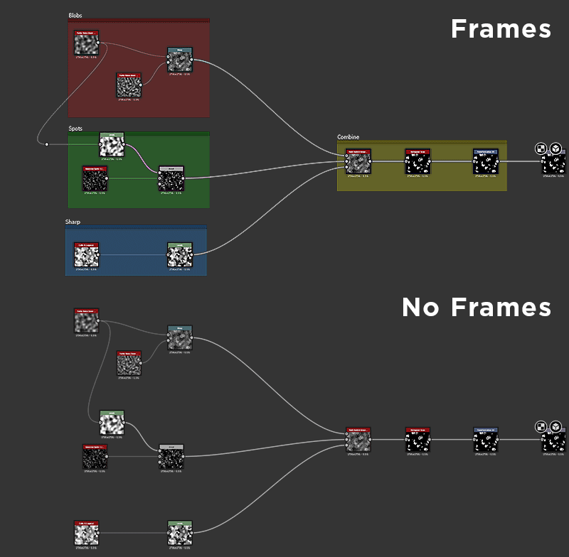

Frames make it much easier to understand what is going on in a graph. They can help you as an author coming back to your work months later, or another user such as a colleague to find their way around a Graph they are not used to.
Use the following criteria when placing Frames:
- Identify chunks of functionality (for example a 8 nodes that together create a dirt effect) and group these using Frames.
- Always try to use different colors for your Frames: Frames with the same blue, default color don't stand out much from each other.
- Use clear, descriptive names that are not overly long (see section below for more tips)
- Don't put too much or too little in a Frame, as this doesn't help readability. The exact amount obviously differs between graphs and functiuonality.
- If neccessary, add text in the description to help understand what happens in a frame.
Comments and Pins
Comments and pins are only secondary to Frames and are not an absolute must for well-authored graphs. They can be used in the following scenarios:
- Comments are good for adding additional text beyond what a Frame's description allows. You can add small bits of text per-node, mostly for little detailed pieces of info. Comments do not scale well and don't read from a distant zoom level.
- Navigation Pins allow you to cycle through specific areas of the Graph using the F2 shortcut. This can be useful for very big graphs where one often needs to jump between two areas that are very far from each other.
Input & output placement
Inputs and outputs should be placed at the extreme ends of Graphs: all outputs on the right, all inputs to the left, each vertically aligned. This makes it easier to find and identify them.
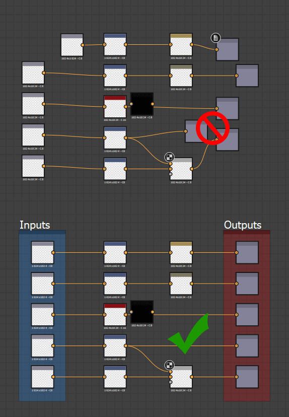

The above example is an extreme case: Frames are not always needed or possible, but it should be clear that vertical alignment of In- and Outputs is a lot more clear that random, shuffled placement.
Link rerouting
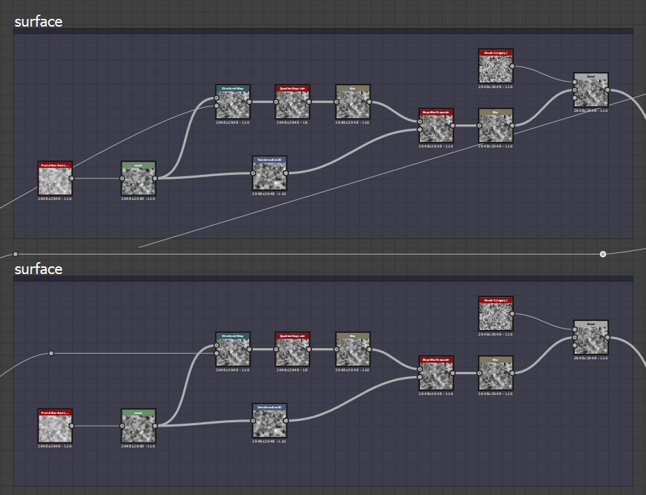
In large, very long Graphs, sometimes links are made across a very large span. This leads to confusing Link wires crossing through the Graph without much control. The shortcut "Alt + Shift Drag" allows you to reorganize these Links, rerouting them on a different path by subdividng a link and adding an extra handle in the middle. It is recommended to make use of this in scenarios where it makes sense.

Label, indentifier and usage
Any Graph that is meant for sharing or publishing should have proper care put into the additional metadata that improves user-friendliness. The following points are important:
The default suggested Labels are never sufficient, take the time and effort to add custom Labels to exposed parameters and your in- and outputs.


Try to not have identifier and Label differ too much: in case the Identifier is used elsewhere (in multiple Functions) it can be very hard to find which UI property is related to what variable.


Try to match your Labels to terms you use in Frames (Frame Labels) and comments. It makes it easier to find out what section of the graph is linked to what exposed parameter


Parameter settings
When exposing Parameters, more than just the Label and Identifier is important, The following points should be kept in mind:
- Choose the correct Editor type. A Slider might not always make sense: an Angle or Dropdown Ui element are also possibilities.
- Set up proper Min and Max values and decide if clamping them makes sense.
- Choose a default value that makes sense: Defaults that reurn useless, edge case results should be avoided.
- Consider remapping the range through a Function if required: a Slider from 0.125 to 0.357 doesn't make any sense, you can easily remap this with a Linear Interpolation and have the UI element utilize a 0 to 1 range.
Substance graphs
Color & grayscale management
Great care is required when using color and Grayscale data, mixing both types can't be done easily on the fly. The following points should be kept in mind:
- Graphs should never contain dotted red (error) links.
- There should be no unnecessary conversions between color and grayscale and vice-versa. In some cases the "automatically insert color/grayscale conversion node" in the Graph Preferences can lead to long, useless chains of Docked conversion nodes.
- Data is ideally kept as grayscale as long as possible, and only converted when absolutely needed. This reduces complexity and saves on performance.
- Inputs and Outputs should be created or set-up with the correct type in mind: for example it makes no sense to have a "mask" input set to color if it will be converted to grayscale for use as a binary mask.


Resolution control
Controlling the resolution of a Substance graph can be confusing, so proper care is required to do this correctly. Making mistakes can lead to severly impacted peformance, or low-quality, unuseable results.
To fully understand this topic make sure you know about Absolute and Relative Output Sizes.
- A graph should be set to "Relative to Parent" resolution in almost every case, unless there is a very specific exception where it is not required (very rare).
- Nodes generally shouldn't have override settings for the Output Size. Resolution is best controlled through the Parent or Graph properties in most cases.
- For Bitmaps, special care should be set that the default, Absolute Output Size does not spread throughout the entire Graph, this should be overriden to Relative to Parent. This is one of the few exceptions to the above rule.